Preview image. Unlock full-res
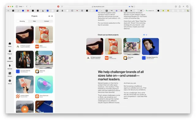
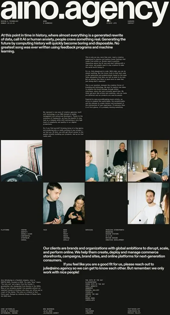
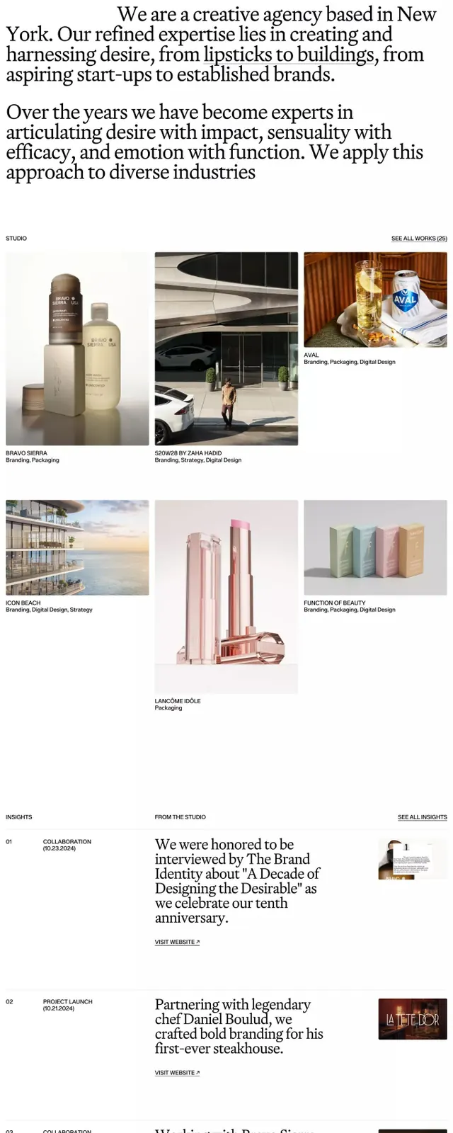
Dark editorial layout with a 3-column grid of colorful project tiles, bold headline, and body copy on a light side panel.
Summary
Dark editorial layout with a 3-column grid of colorful project tiles, bold headline, and body copy on a light side panel.
Visual description
Left side: a 3-column grid of project cards with vibrant, varied imagery (food, design, people, environments) on dark background. Right side: light off-white panel containing a multi-line sans-serif headline ("We help challenger brands of all sizes take on and unseat market leaders") followed by two columns of body text. Top navigation menu is compact and dark. Each project tile uses a bold sans-serif label. The grid is tightly spaced, making the dark field feel dense. The contrast between the dark grid area and the light text panel creates a strong visual hierarchy. Color accents appear as small orange and purple labels on some cards.
Key takeaway
The split-panel strategy dividing dark content showcase from light narrative text. The tight 3-column grid makes many projects feel richly curated without overwhelming. Small colored accent labels break visual monotony on a dark field. The headline and supporting copy use sans-serif with generous line-height, making dense text scannable.
Reuse notes
Effective for agency and portfolio sites showcasing client work or case studies. The dark grid allows colorful imagery to dominate while the light panel accommodates long-form copy. Works well when the project images are visually distinctive or varied; repetitive colors in the tiles would lose impact.
More like this





Keep what you find
A free account saves references to boards and can send you a weekly email of picks based on what you save.
To see every result, go Pro.