Preview image. Unlock full-res
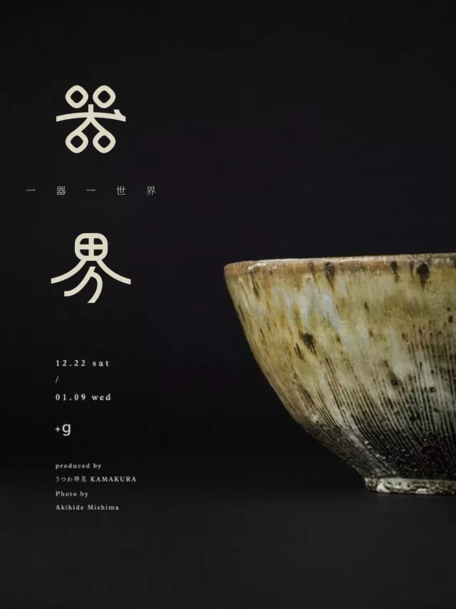
Minimal editorial composition pairing geometric line-art symbols with a weathered ceramic vessel, unified by a stark dark ground and restrained typography.
Summary
A restrained editorial layout pairing delicate line-art symbols and Japanese characters with a large textured ceramic bowl against a near-black ground, embodying wabi-sabi craft aesthetics.
Visual description
Deep charcoal background occupying most of the frame. Left half: a minimal symbol system in cream/off-white, including four circular forms arranged in a cross motif (top), a stick figure below with horizontal crossbar head, and small Japanese characters (middle of composition). Bottom left: event information in thin sans-serif (dates, "+g") and production credits in small type (producer: Kamakura; photographer: Akihide Mishima). Right half: a large ceramic bowl, cream with deep charcoal brush marks and organic firing variations, positioned at 45 degrees, occupying roughly the right third of the frame. Strong asymmetric balance between graphic minimalism and tactile material presence.
Key takeaway
Pairing abstract symbol systems with authentic material photography creates visual tension between order and nature. The monochrome palette with subtle earth tones (cream against deep brown/black) feels both refined and approachable. Japanese design influence (characters, craft, negative space) conveys cultural specificity without pastiche.
Reuse notes
Ideal for design studios, craft brands, cultural publications, and editorial work. Works for event posters, book covers, gallery materials. Requires a genuinely beautiful ceramic or material object to carry the right side; sourcing is key. Limited color palette demands careful typography pairing.