Preview image. Unlock full-res
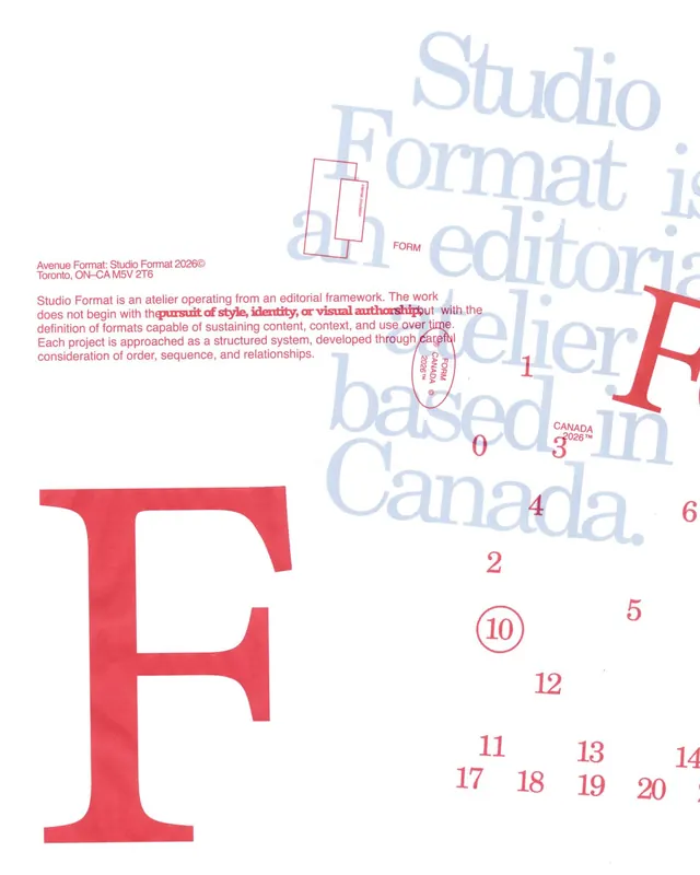
A structured brand identity system featuring a bold red F mark as the primary symbol, with an editorial serif typeface and numbered grid framework.

Summary
A structured brand identity system featuring a bold red F as the primary mark, paired with a refined light serif typeface and a numbered grid framework demonstrating the system's application.
Visual description
A light background showcases a large, bold red F positioned in the lower left as the primary identity mark. Above and to the right, light serif typography in muted blue-purple tones spells out "Studio Format" and "editorial," representing the typeface system. Small red rectangular frames and numbered elements (0–20) scattered throughout illustrate the grid and spatial relationships. Red body copy on the left explains the editorial framework and design philosophy. The minimal palette of red, muted serif type, and white demonstrates cohesion and clarity in the system.
Key takeaway
A single bold geometric mark (F) paired with refined serif typography creates editorial sophistication without complexity. The numbered grid elements show structured, systematic thinking. The hierarchy between the oversized mark and delicate typeface achieves visual interest through restraint, not addition.
Reuse notes
Effective for design studios, agencies, or editorial-focused brands seeking sophistication. The bold/refined pairing works well for high-end services. The grid-based approach is adaptable across applications. Strong for portfolio, agency, publishing, and design-focused identities.
More like this




Keep what you find
A free account saves references to boards and can send you a weekly email of picks based on what you save.
To see every result, go Pro.