Preview image. Unlock full-res
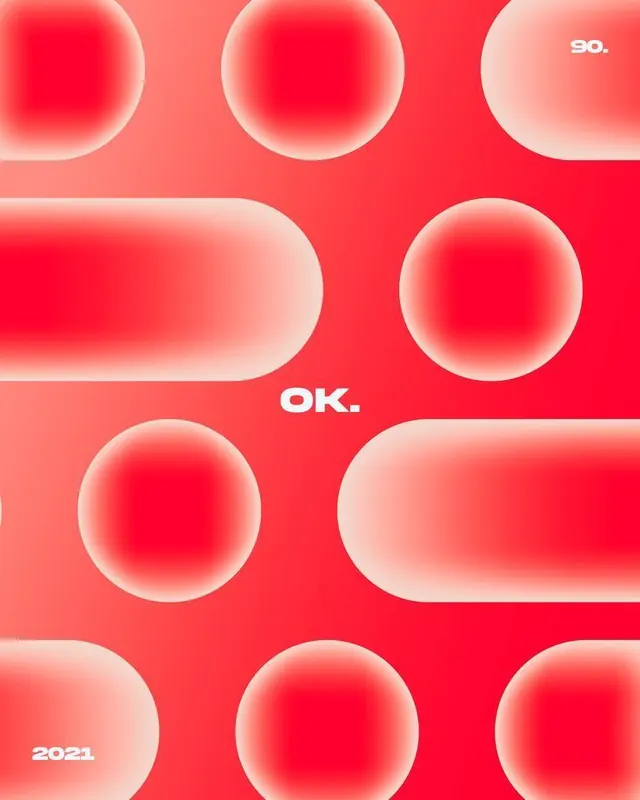
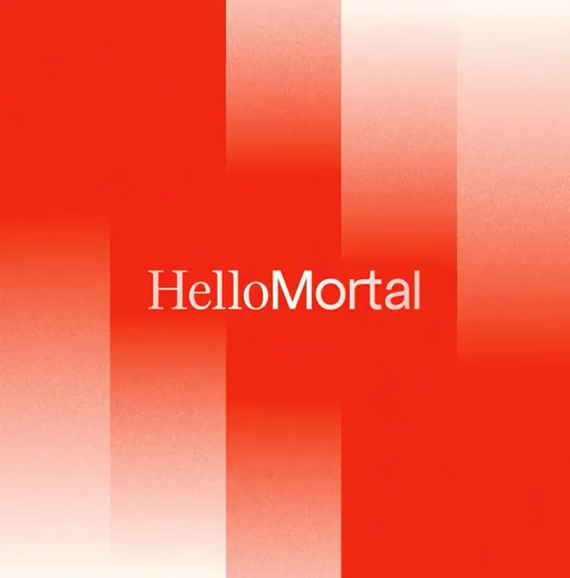
Brand identity system using modules of concentric circles and rounded rectangles in crimson gradients with scattered text anchors.
Summary
Brand identity system using concentric circles and elongated pill shapes in crimson-to-coral gradients, text-anchored to "90.", "OK.", and "2021".
Visual description
Vibrant coral-red background filled with modular elements: a grid of soft-focus concentric circles (some complete, some partial) rendered with radial gradients fading from saturated red centers to pale pink edges, plus two elongated rounded rectangles in the same gradient family. White sans-serif text appears anchored at cardinal points: "90." (upper right), "OK." (center), "2021" (lower left). The repeated circle-and-pill motif creates visual rhythm and suggests a system ready to scale across applications.
Key takeaway
The soft-focus gradient technique (sharp center fading to translucent edge) makes flat circles feel dimensional without 3D. Modular circles are endlessly pairable with typography. The warm palette (red-to-coral-to-pink) reads as energetic yet approachable.
Reuse notes
Use for brands needing warmth, confidence, and geometric sophistication. Works well for modern consumer or creative verticals. The gradient softness suits product design, packaging, and motion systems. Avoid for conservative/corporate audiences.
More like this




Keep what you find
A free account saves references to boards and can send you a weekly email of picks based on what you save.
To see every result, go Pro.