Preview image. Unlock full-res
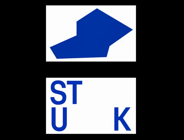
Bold wordmark featuring a rightward-pointing chevron mark above stacked sans-serif capitals, unified by monochromatic blue and white.
Summary
Bold wordmark with a geometric blue chevron stacked above two-letter capitals, locked into a clean monochromatic identity.
Visual description
A centered composition in two parts: above, a solid blue right-pointing chevron with sharp edges against white negative space; below, the letters "ST" and "K" in heavy sans-serif caps, letter-spaced and arranged in an off-center rhythm. The entire mark is rendered in a single corporate blue (#0031A2) on white, with crisp edges and no decorative softness. The arrow carries institutional authority.
Key takeaway
The stacking of an icon and text into a modular mark, and the use of a single directional arrow to anchor both parts. The negative space between the chevron and the letterforms prevents visual collision while maintaining a unified brand. The rhythm of the letter spacing feels dynamic despite rigid geometry.
Reuse notes
Strong template for technology companies, consulting firms, or developer-focused brands seeking geometric authority without ornament. Works best at square or landscape layouts. Ensure the wordmark abbreviation actually abbreviates a memorable name.