Preview image. Unlock full-res
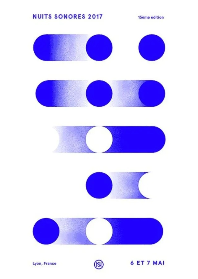
Event identity system using stacked horizontal bars and circles with gradient-to-solid transitions, showcasing modular assembly of geometric shapes in cobalt blue.
Summary
A modular identity system built from geometric primitives: bars fade from cobalt to lavender, circles stack in permutations, each arrangement unique yet instantly recognizable as the same brand.
Visual description
The poster uses five stacked horizontal modules, each pairing a gradient bar (solid blue fading to light lavender) with one or two solid circles. The bars shift directions (some left-to-right, some right-to-left) and the circles reposition across each row, creating rhythmic variation. White background isolates the blue elements. At the top, "NUITS SONORES 2017" in sans-serif caps (blue) labels the event, with "15eme edition" in smaller type. Bottom shows "Lyon, France" (blue), a round icon with serif marks, and "6 ET 7 MAI" (blue). The gradient-fade technique on the bars creates motion and depth, suggesting a sonic visual metaphor.
Key takeaway
The reusable grammar: a limited kit of shapes (bars, circles) in one color, composed in different arrangements to signal variety while holding the brand constant. The gradient-to-solid bar as a directional, animated-feeling device. The white space allowing each module to breathe and read at a glance.
Reuse notes
Strong for music, cultural, and event branding where you need to show flexibility and energy without losing clarity. The geometric purity works in posters, signage, and applied materials. Pairs well with bold sans-serif typography and minimal layouts.
More like this


Keep what you find
A free account saves references to boards and can send you a weekly email of picks based on what you save.
To see every result, go Pro.