Preview image. Unlock full-res
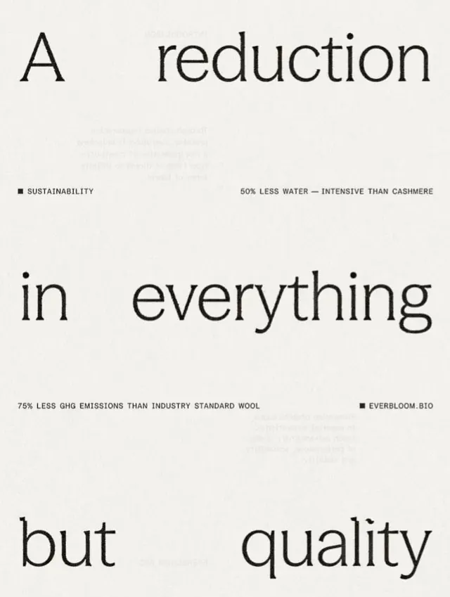
High-contrast type specimen for eco-textile brand Everbloom.bio, featuring stacked sans-serif headlines with sustainability metrics and brand callout in a monochromatic palette.
Summary
Everbloom.bio type specimen sets bold sans-serif headlines vertically, each paired with a sustainability claim (50% less water, 75% less GHG), using extreme contrast and generous white space to convey premium, honest eco-textile positioning.
Visual description
A cream-background poster presents three oversized sans-serif headlines stacked vertically: "A", "reduction", "in", "everything", "but", "quality". Each headline is interrupted by a small black square and sans-serif callout stating specific sustainability metrics: "SUSTAINABILITY" with "50% LESS WATER INTENSIVE THAN CASHMERE", and "EVERBLOOM.BIO" with "75% LESS GHG EMISSIONS THAN INDUSTRY STANDARD WOOL". The type is black, the squares anchor the rhythm, and the composition relies entirely on hierarchy, weight, and negative space.
Key takeaway
The vertical stacking with interrupting information blocks creates a narrative flow without imagery. Each headline line breaks at a sensible word boundary, forcing the reader through the claims. The small sans-serif metric labels in caps contrast against the large display headlines, establishing clear hierarchy through scale alone.
Reuse notes
Ideal for eco-brands, material-focused marketing, and premium product launches. The format works in print, digital, and OOH. Works best with single-color or very high-contrast palettes; avoid color gradations. The metric callouts must be legible at smaller scale; test in context before committing.
More like this



Keep what you find
A free account saves references to boards and can send you a weekly email of picks based on what you save.
To see every result, go Pro.