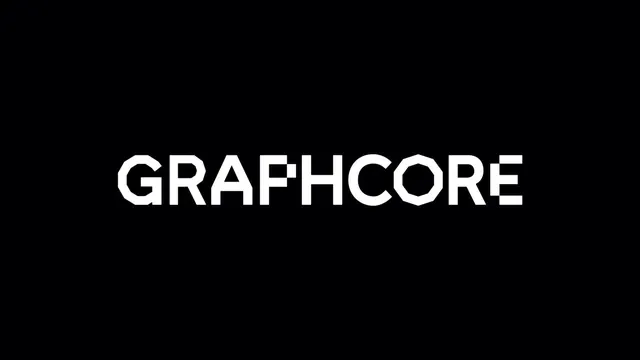
Preview image. Unlock full-res
Bold, geometric sans-serif wordmark in white against pure black, emphasizing structural clarity and technical precision.
Summary
Bold, all-caps geometric sans-serif wordmark in white against pure black, creating maximum contrast and strict structural identity.
Visual description
Pure black background with centered white letterforms spelling "GRAPHCORE" in a geometric, condensed sans-serif. The typeface uses closed counters and uniform stroke weight, with letters stacked horizontally. No decoration, no gradient, no secondary marks. The negative space is equal and distributed, allowing the type itself to be the sole information carrier.
Key takeaway
The discipline of using only contrast and geometry to convey technical confidence. No need for a mark or logo-specific letterform modification when the typeface itself is strong. The monochrome palette forces clarity.
Reuse notes
Strong for hardware, developer tools, and B2B brands that need to signal precision. Works equally well at logo scale or as a wordmark system. The all-caps geometry reads instantly at any size.
More like this




Keep what you find
A free account saves references to boards and can send you a weekly email of picks based on what you save.
To see every result, go Pro.