Preview image. Unlock full-res
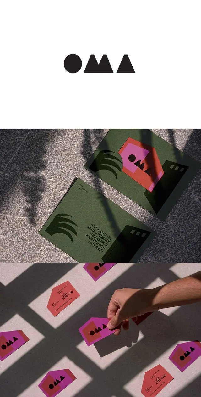
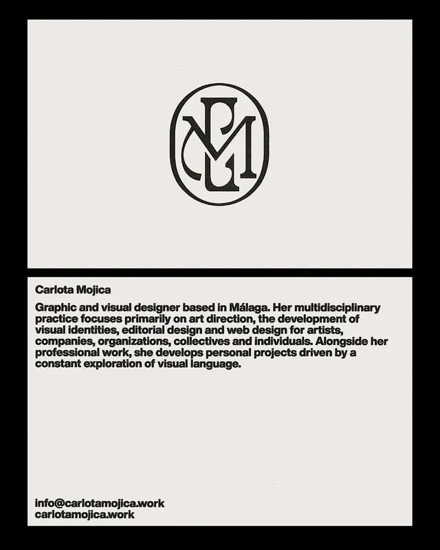
Geometric stationery system combining a minimal circle-and-arrow mark with angled business cards in sage, coral, and black, photographed on textured paper.
Summary
A minimal identity system using a simple geometric mark paired with folded business cards in muted earth tones, demonstrating restraint through shape and color alone.
Visual description
Top section shows a wordmark consisting of a black circle on the left with a small angled mark inside, followed by two overlapping equilateral triangles forming an "M" shape, all rendered in solid black on white. Below is a photograph of the system applied to stationery: business cards in sage green, coral, and black are positioned at angles on textured grey and beige paper, their edges catching warm studio light and casting sharp shadows. The cards repeat the circle-and-triangle mark. A hand enters the frame holding one coral card, emphasizing the object's tactile quality and small scale.
Key takeaway
The mark's extreme economy: two geometric elements convey both a company identity and tactile system language without ornamentation. The offset, layered card photography shows material and depth without a background image, making the identity readable at real scale. The warm-toned shadow play against cool paper grounds gives dimensionality to an otherwise austere palette.
Reuse notes
Ideal for minimalist consultancies, tech studios, and design-focused brands where constraint reads as confidence. Works especially well for stationery systems where physical handling and light are part of the brand experience. The geometric forms feel contemporary but not dated; the earth tones date-proof the whole suite.
More like this


Keep what you find
A free account saves references to boards and can send you a weekly email of picks based on what you save.
To see every result, go Pro.