Preview image. Unlock full-res
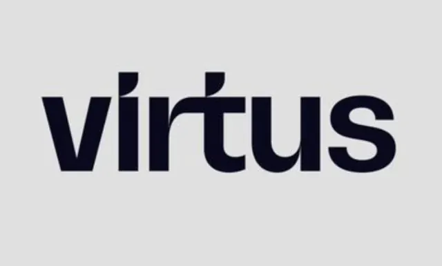
A wordmark for Virtus set in a bold, geometric sans-serif typeface with strong ascenders, centered against white space with confident negative space.
Summary
A wordmark for Virtus set in a bold, geometric sans-serif typeface with strong ascenders, centered against white space with confident negative space.
Visual description
The word "Virtus" is rendered in a compact, geometrically constructed sans-serif font with uniform stroke weight throughout. The letterforms are blocky and angular, with distinctive serif-like terminals on the capital V and distinctive rendering of the U. Set in navy or very dark blue-gray, the wordmark occupies the vertical center of a light gray rectangular field, surrounded by generous white space on all sides. The ascender marks on V and U add subtle visual interest to an otherwise utilitarian letterform structure.
Key takeaway
The bold weight and geometric construction convey technical authority without ornamentation. The centered placement within generous negative space lets the wordmark breathe and feel premium. Strong stroke contrast and simple geometry make it work across sizes.
Reuse notes
Effective for technology, SaaS, consulting, or B2B branding where confidence and modernity matter more than personality. Works best when scaled to dominate a layout or presented as a standalone mark. The simplicity reads well at small sizes.
More like this






Keep what you find
A free account saves references to boards and can send you a weekly email of picks based on what you save.
To see every result, go Pro.