Preview image. Unlock full-res
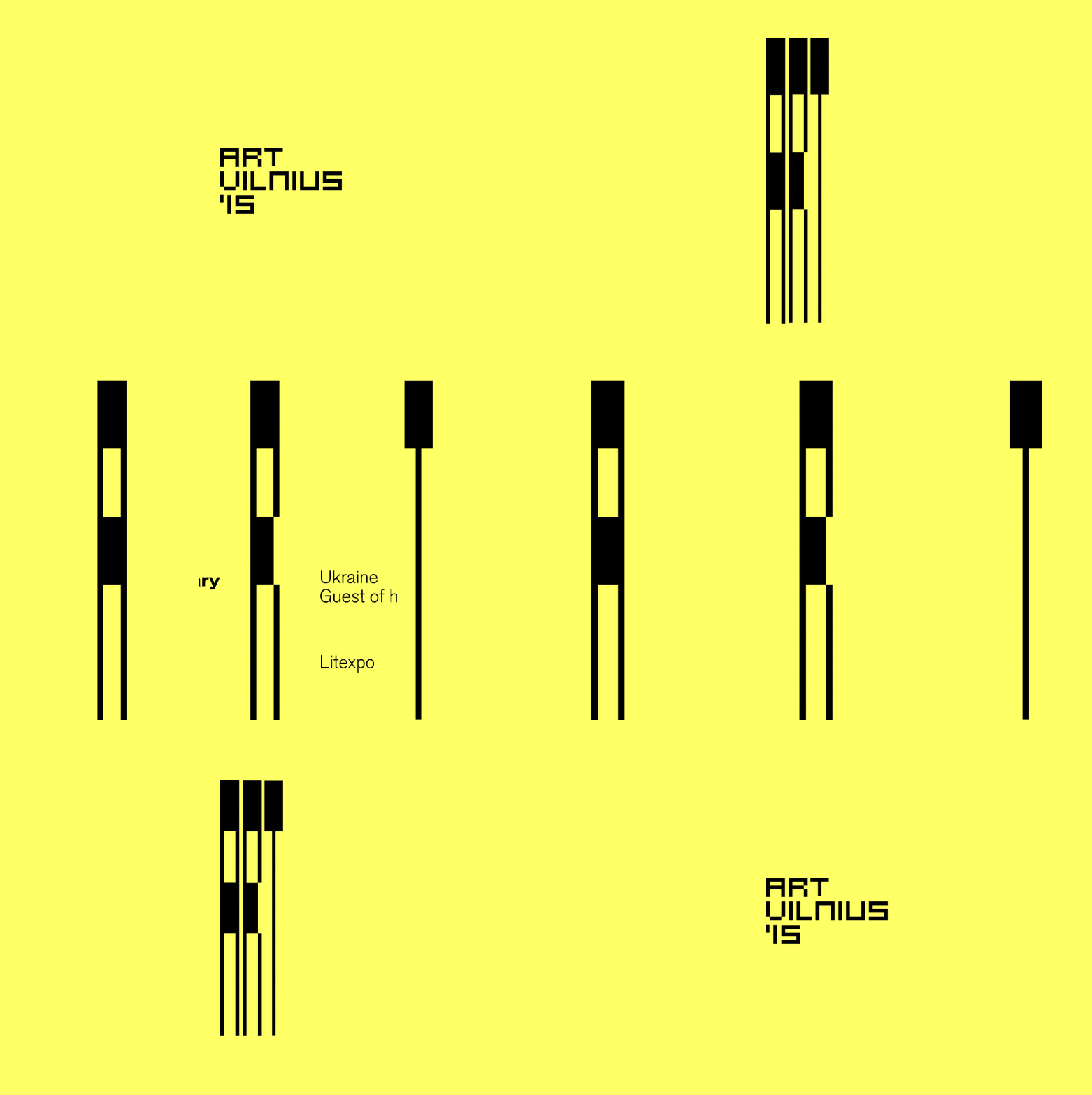
Bright neon-yellow background with a centered block of black uppercase sans-serif text reading 'ART VILNIUS IS', using a single typeface for absolute clarity and legibility.
Summary
Institutional identity system using a bright neon-yellow background and centered black all-caps sans-serif text stating the organization's name and descriptor.
Visual description
Flat neon-yellow background. A three-line black sans-serif text block is centered both horizontally and vertically, reading "ART / VILNIUS / 'IS" in all caps with generous letter spacing. The typeface is geometric with clean, squared-off forms. No secondary elements, no imagery, no color variation, just the text floating in the yellow field creating maximum contrast.
Key takeaway
The absolute commitment to a single typeface and two colors creates an identity that is instantly recognizable and utterly scalable. All-caps with extra letter spacing gives authority and makes the text feel designed rather than neutral. The centered yellow-on-black (inverted to black-on-yellow) approach signals institutional confidence and works equally well on signage, digital, or print.
Reuse notes
Strong framework for cultural institutions, nonprofits, or public organizations needing a bold, unmistakable identity. High contrast ensures visibility on environmental graphics. The simplicity leaves room for extensive system extension (secondary typeface families, layout rules, accent colors). Works best with significant space around the wordmark.
More like this


Keep what you find
A free account saves references to boards and can send you a weekly email of picks based on what you save.
To see every result, go Pro.