Preview image. Unlock full-res
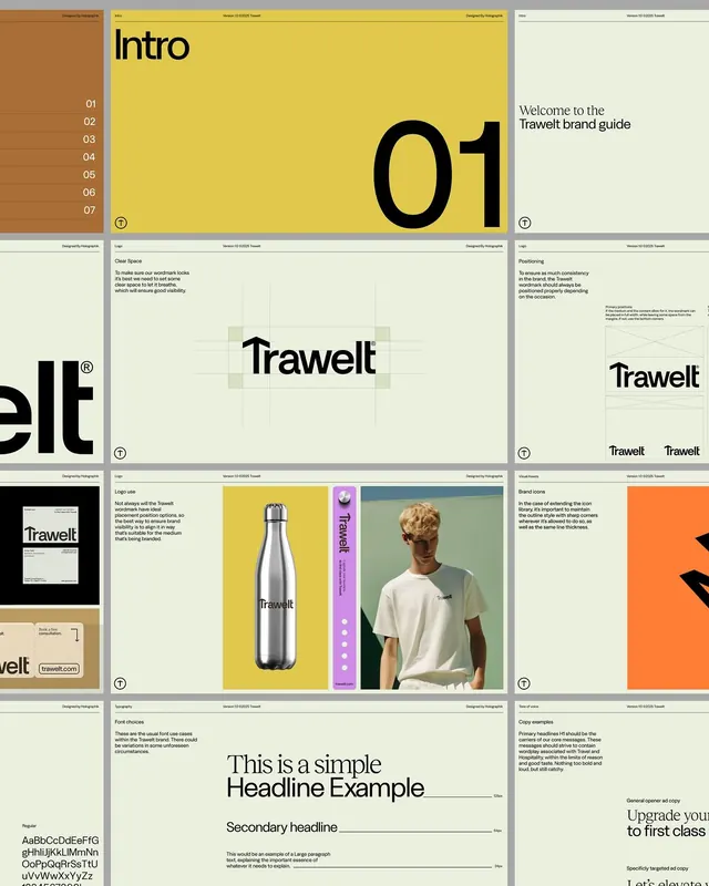
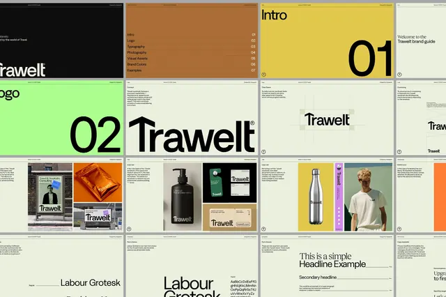
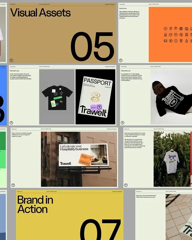
Comprehensive travel-lifestyle brand identity balancing warm earthy tones (mustard, rust, clay) with serif and sans-serif typography, shown across guideline pages, product applications, and apparel.
Summary
A travel brand identity system using warm earthy tones and balanced serif/sans-serif pairing, shown across an indexed guide with applications to products, apparel, and promotional materials.
Visual description
A six-page brand guide spread. Top left shows a numbered index (01-07) against a clay-brown sidebar and pale cream background, introducing the system. Top center displays a large serif "Trawelt" wordmark with a registered trademark symbol in black on mustard yellow. Top right shows the word "Trawelt" in different typographic treatments with accompanying guidance text. Middle sections showcase the mark applied: a minimal monogram in the "elt" portion, secondary logo lockups, and the wordmark in various sizes. Lower half shows applications: a stainless-steel water bottle labeled "Trawelt" in mustard yellow and white on the pale cream; a purple packaging/sleeve with "Trawelt" in white; a model wearing a cream t-shirt with a small "Trawelt" chest mark. Bottom pages detail a serif typeface specimen with headline and body text combinations, a color palette showing warm tones (cream, mustard, rust, taupe, soft gray), and layout grid guidelines with typography hierarchy examples.
Key takeaway
The restrained color palette—four warm tones sitting in a tight harmony that feels sophisticated and travel-adjacent without being trendy. The discipline of pairing a contemporary serif (for headlines/brand) with a supporting sans-serif (body/UI), clearly separated by function. The indexing system (01-07) as a visual organizing device, echoed in the grid layout itself for consistency and legibility.
Reuse notes
Effective for travel, lifestyle, or premium consumer brands where warmth and approachability matter. The serif/sans pairing works well for brands that want editorial presence without pretension. The modular grid approach pairs well with photography-heavy campaigns. Avoid if your brand needs high energy or technical seriousness.
More like this



Keep what you find
A free account saves references to boards and can send you a weekly email of picks based on what you save.
To see every result, go Pro.