Preview image. Unlock full-res
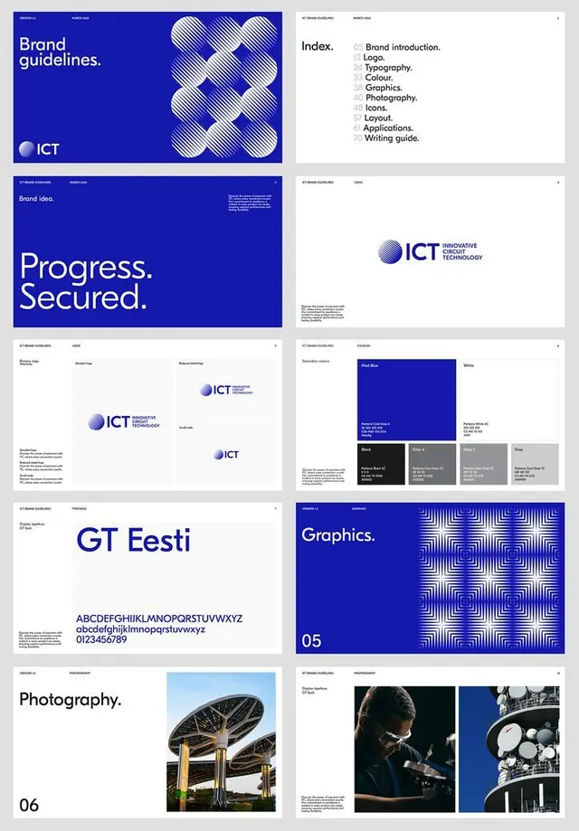
Comprehensive brand guideline deck showcasing modular geometric pattern language, logo variations, and visual system hierarchy in cobalt blue and white across multiple sections.
Summary
A corporate tech-brand guideline deck organized as an indexed system, showing modular geometric patterns, logo variations, color swatches, typeface specimen, and photography principles across multiple pages.
Visual description
Grid of nine guideline pages: (top row) blue brand-guidelines cover with wavy geometric pattern and ICT logo, table of contents page, and brand-idea page with "Progress. Secured." tagline; (middle row) logo usage and logo variations pages, and color-system swatches in blue, gray, navy, and white; (lower rows) typography page showing GT Eesti typeface with alphabet and numerals, a photography rules page with industrial architecture image and detail shots. Each page uses a consistent grid with generous white space, sections labeled with page numbers and category names. The color palette stays consistent across all pages: bright cobalt blue, navy, white, and cool grays.
Key takeaway
The numbered index structure (table of contents visible on cover) makes the system scannable. Wavy geometric pattern as a repeating brand motif adds visual personality without clashing with minimalist layout. The comparison of logo variations and color swatches side-by-side on a single page conserves space while showing how elements relate. Photography guidance pages set clear contextual expectations.
Reuse notes
Excellent template for a tech or B2B brand deck. The deep blue and white palette conveys trustworthiness and innovation. Modular geometric patterns work in many industries. Print or digital; the clear grid adapts to either. Best for brands where geometric consistency and professional restraint matter more than color diversity.