Preview image. Unlock full-res
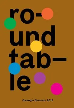
A graphic type specimen combining stacked, heavy sans-serif wordplay against a warm terracotta ground, punctuated by bright, floating accent circles in contrasting neon hues.
Summary
A graphic type specimen combining stacked, heavy sans-serif wordplay against a warm terracotta ground, punctuated by bright, floating accent circles in contrasting neon hues.
Visual description
Black, oversized sans-serif type stacks vertically spelling "ro-und-tab-le" across a warm terracotta/brown background. Five solid circles in electric green, coral pink, yellow, teal, and magenta float among the letters, breaking up the vertical rhythm and adding playful visual energy. The type appears deliberately distressed or hand-rendered, not perfectly mechanical. Small credit text "Gwangju Biennale 2012" sits at the bottom in tiny sans-serif, suggesting a cultural institution or art exhibition context. The composition balances density of type against the simplicity of the abstract circle elements, creating visual tension that feels modern and gallery-ready.
Key takeaway
The strategic use of floating geometric shapes to interrupt type-heavy layouts without adding legibility friction. The warm-to-neon color contrast strategy (earthy base, bright accents) for high visual impact. The stacked, character-breaking wordplay technique creating a playful, experimental tone even with serious-looking sans-serif type.
Reuse notes
Ideal for art exhibition catalogs, design-forward posters, experimental typography showcases, and branding for cultural institutions. The heavy type and neon accents work well at large scale (prints, installations) and suit young, artistic, design-forward audiences. The warm terracotta base limits flexibility—works less well on cool palettes.
More like this
Keep what you find
A free account saves references to boards and can send you a weekly email of picks based on what you save.
To see every result, go Pro.