Preview image. Unlock full-res
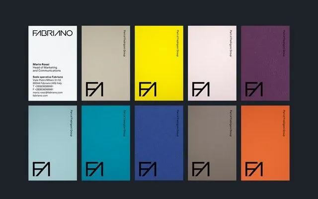
Ten-card identity system showing brand mark over varied color backgrounds with metadata strips, demonstrating systematic color and mark deployment.
Summary
Ten-card identity system showing brand mark over varied color backgrounds with metadata strips, demonstrating systematic color and mark deployment.
Visual description
Dark charcoal background. Grid of ten cards arranged five columns by two rows. Each card has a solid color field (bright yellow, pale pink, deep teal, warm orange, cool navy, light cyan, soft taupe, dark purple, burnt sienna, soft gray) with a geometric black-lined angular mark (sharp arrow or chevron shape) in the lower right corner. Each card carries a thin metadata strip rotated vertically along the right edge with small sans-serif text. First card (white) shows full contact information and marks. Cards demonstrate the mark across high-contrast and muted color combinations. Systematic, spare typography.
Key takeaway
The card format makes palette tangible and extensible. Metadata strips on each color show how the mark and type hold across variations. The single geometric mark becomes an identity anchor that works on any background. Tight grid structure is both systematic and visually striking.
Reuse notes
Ideal for design studios, type foundries, or portfolios showing design-system discipline. The card layout translates well to print, digital showcases, or brand-guideline documents. Works best when the mark is memorable and the color palette is curated.
More like this




Keep what you find
A free account saves references to boards and can send you a weekly email of picks based on what you save.
To see every result, go Pro.