Preview image. Unlock full-res
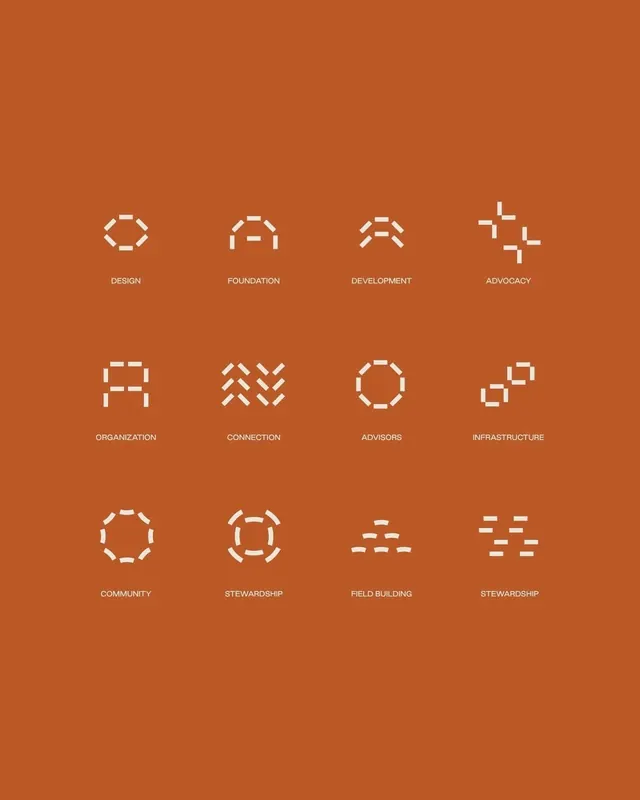
Twelve white line-art icons arranged in a 4x3 grid against a warm burnt orange field, each with a single-word label describing organizational and structural concepts.
Summary
Twelve white monochromatic icons using consistent line weight and geometric forms, arranged in a regular grid with centered labels on a warm burnt orange background.
Visual description
A burnt orange background holds a 4x3 grid of icons rendered in white outline. Each icon uses the same stroke weight and construction logic: hexagonal forms, stacked shapes, network patterns, chevrons, dotted outlines, and crossed lines. Labels positioned below each icon use a clean sans-serif in all caps: Design, Foundation, Development, Advocacy, Organization, Connection, Advisors, Infrastructure, Community, Stewardship, Field Building, and another Stewardship variant. The icons are evenly spaced with generous white margins, creating a calm, organized visual rhythm.
Key takeaway
The consistent construction method (shared line weight, geometry) across diverse symbol concepts. The warm background color builds warmth without competing with the icons. The symmetrical grid with room to breathe conveys professionalism and thoughtfulness, not corporate coldness.
Reuse notes
Strong fit for nonprofit, foundation, or consulting brand systems. The burnt orange is distinctive and welcoming; the line style scales well from app UI to printed collateral. Works best in contexts where clarity and trust matter more than visual novelty. Consider the warm palette when pairing with complementary colors or secondary palettes.
More like this



Keep what you find
A free account saves references to boards and can send you a weekly email of picks based on what you save.
To see every result, go Pro.