Preview image. Unlock full-res
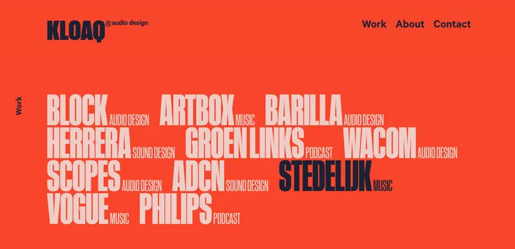
Vibrant orange portfolio page using overlapping white sans-serif text blocks to list audio and music production projects with high typographic contrast.
Summary
An audio production studio's work portfolio displayed as overlapping uppercase sans-serif blocks on a bold orange background, layering project names with their disciplines.
Visual description
A vibrant orange background (approximately #F8452B) fills the entire frame, establishing a warm, energetic visual foundation. White and light-cream uppercase sans-serif text blocks overlap across the composition, listing project names (Block, Artbox, Barilla, Herrera, Groenlinks, Wacom, Scopes, Adcn, Stedelijk, Vogue, Philips) each paired with small secondary text indicating discipline (Audio Design, Music, Podcast, Sound Design). A dark navy sans-serif logotype "KLOAQ audio design" anchors the top left. Navigation links "Work / About / Contact" appear in the dark navy at top right. A vertical "Work" label rotates along the left edge. The text blocks are staggered and rotated slightly, creating dynamic visual rhythm while maintaining legibility. A small "STEDELIJK" project name appears in dark navy among the white text, breaking the color pattern and adding focal emphasis.
Key takeaway
The dense typographic layering creates visual interest without imagery, making the portfolio feel energetic and design-forward. The single bold accent color in the background makes the white type pop with maximum contrast. The variation in text sizing and subdued secondary descriptors (disciplines) below primary project names creates hierarchy within a flat design. The overall system is flexible enough to add or remove projects without disrupting the layout composition.
Reuse notes
Strong for creative studios, audio/music production, and design agencies seeking vibrant, confidence-forward portfolio presentations. The orange background communicates energy and creativity effectively. The all-caps typography treatment reinforces a bold, assertive studio voice. Works well for digital portfolio websites or printed promotion materials. Avoid on small screens where text layering might become illegible; best suited to large-format display or desktop viewing.
More like this


Keep what you find
A free account saves references to boards and can send you a weekly email of picks based on what you save.
To see every result, go Pro.