Preview image. Unlock full-res
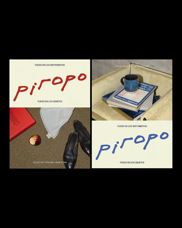
Piropo brand identity uses a split composition contrasting handwritten red and blue letterforms against real-world photography and objects to explore contrasting concepts.
Summary
Piropo's identity splits concept and execution: the left panel shows red handwritten letterforms against a cream background with printed and photographed props; the right panel mirrors the layout in blue, anchored by real objects (books, mug, shoes) and location photography.
Visual description
A four-panel layout on black background. Top-left: cream panel with "FUEGO EN LOS SENTIMIENTOS" in light gray, followed by "piropo" in loose, handwritten red strokes. Bottom-left: photograph of a flat lay on a tan/beige fabric including a red book, cream cloth, black shoes, and a fresh apple. Top-right: photograph titled "HECHO EN CORDOBA-ARGENTINA" showing a blue mug on stacked blue books atop a cream surface. Bottom-right: cream panel with "FUEGO EN LOS OBJETOS" at bottom and "piropo" rendered in a flowing, handwritten blue script in the center. White sans-serif type indicates geography (Cordoba, Argentina) and production details on the photograph. The overall effect positions two handwritten versions of the wordmark as conceptual anchors flanking real documentation of material culture.
Key takeaway
The split-concept visual system that uses color (red/blue) as a structural device to separate abstract (sentiment, words) from concrete (objects, photography). The juxtaposition invites interpretation without explicit hierarchy. Handwritten letterforms against geometric photography creates visual tension that strengthens both. The cream-on-black contrast is high and print-ready.
Reuse notes
Powerful for cultural or editorial brands with conceptual depth, especially those with a regional or craft focus. The handwritten element must be confident and unpolished to avoid feeling precious. Works well when the photography can be consistently sourced from real production or archival contexts. Not suited to corporate or minimal aesthetic contexts; best paired with editorial, nonprofit, or cultural-institution positioning.
More like this


Keep what you find
A free account saves references to boards and can send you a weekly email of picks based on what you save.
To see every result, go Pro.