Preview image. Unlock full-res
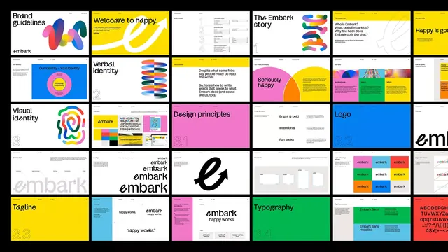
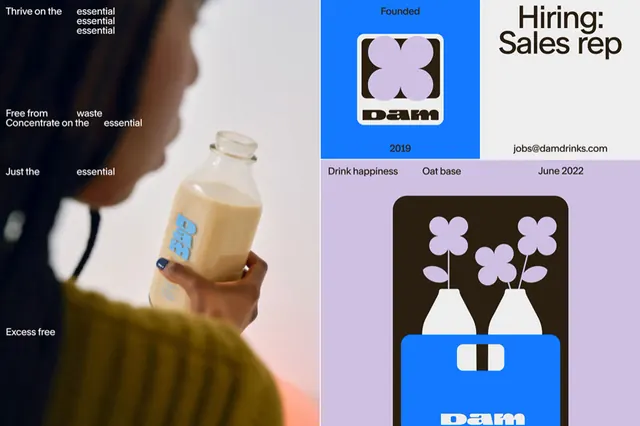
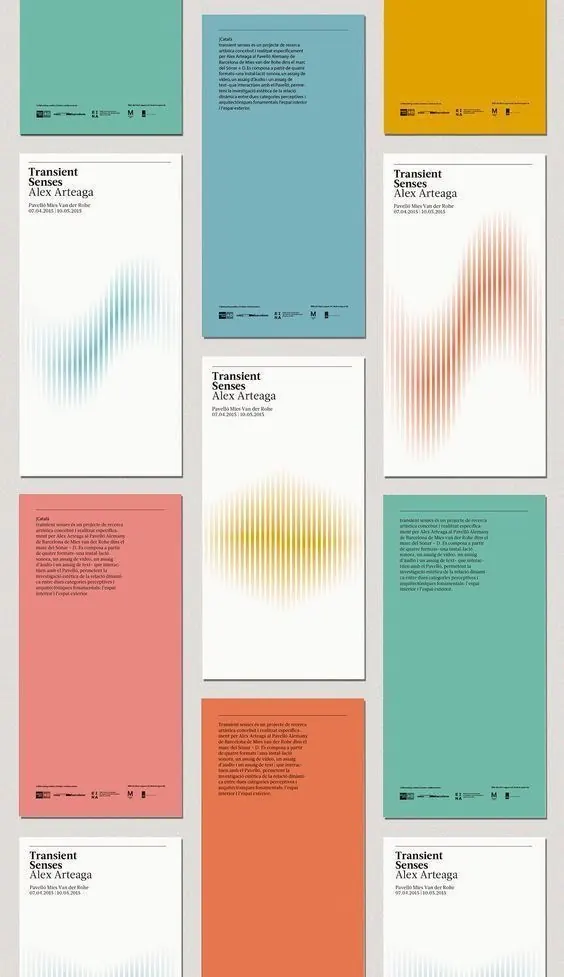
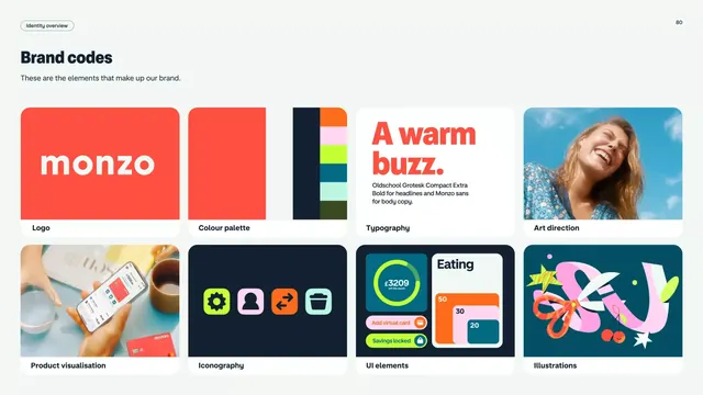
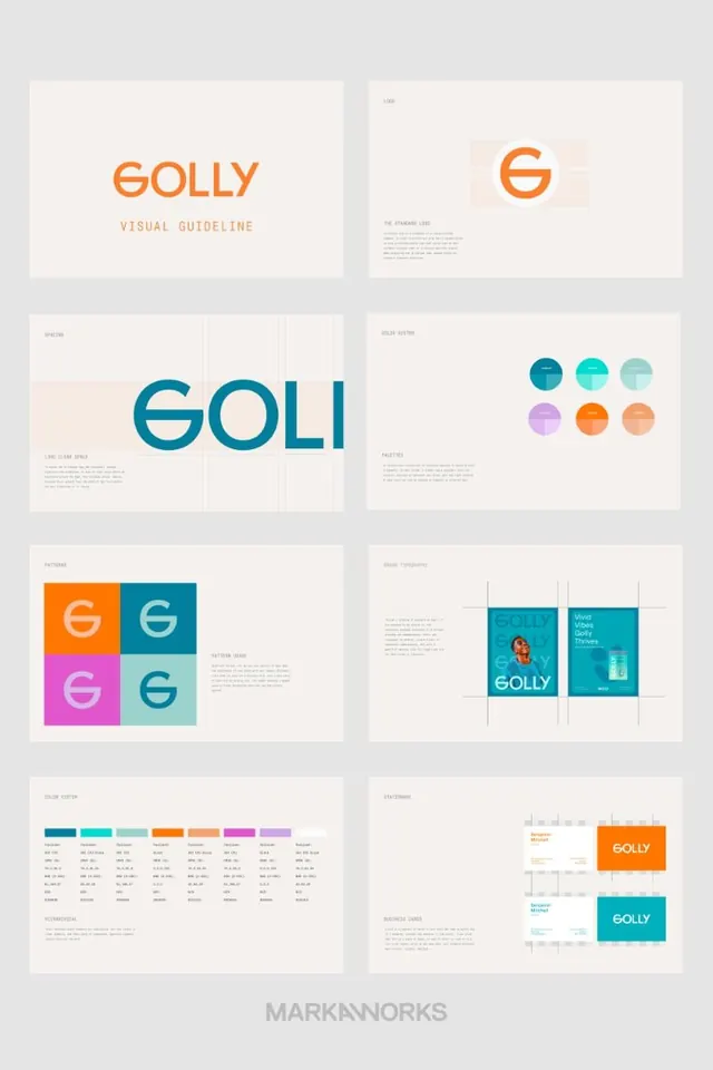
Complete brand identity system for Golly with geometric wordmark, modular grid layouts, and a warm-to-cool color palette across application templates and guidelines.
Summary
A modular identity system for Golly featuring a circular geometric wordmark and icon, anchored by a six-color palette transitioning from teal and orange through pink and purple.
Visual description
A nine-panel brand guide showing: (top) wordmark "GOLLY" in sans-serif with "VISUAL GUIDELINE" callout, (top-right) circular geometric "G" mark and brand intent statement, (middle-left) "GOLI" rendered large in teal as the primary mark usage example, (middle-right) palette of six circles in teal, cyan, light cyan, purple, orange, and peach showing the color system, (lower-left) four-square pattern grid combining the mark in orange, teal, and magenta with subtitle guide, (lower-right) bold typography treatment showing "Vivid Colors" and "Themes" in teal boxes with photographic content, (bottom-left) full color specifications with hex codes and naming, (bottom-right) business card applications showing the mark on teal and white backgrounds with contact info.
Key takeaway
The four-color block pattern system that anchors the mark in different backgrounds while maintaining contrast. The systematic color progression across the palette that feels deliberate rather than arbitrary. The two-weight wordmark treatment that allows both headline and smaller applications.
Reuse notes
Strong for consumer or lifestyle brands seeking a friendly, approachable identity with modular flexibility. The six-color palette is vibrant and supports secondary messaging well. Works across print and digital applications as shown. Avoid if you need a more austere or luxury feel.