Preview image. Unlock full-res
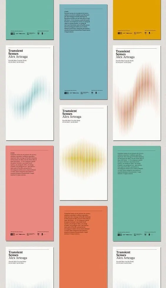
A multi-volume publication identity for Transient Senses featuring distinct color-blocked covers, gradient-line data visualizations, and typography-forward interior spreads.
Summary
A multi-volume publication identity for Transient Senses featuring distinct color-blocked covers, gradient-line data visualizations, and typography-forward interior spreads.
Visual description
Nine publication covers arranged in a grid, each with a solid color field (teal, orange, yellow, coral, green, beige) and minimal typography. The designer repeats a consistent structure: title and credits in small sans-serif at the foot, chapter heading ("Transient Senses" + author name in black serif) anchoring the upper-left, and a full-bleed gradient-field visualization occupying the center-to-right area. These gradients are vertical line-based effects in muted tones of the cover color, suggesting waveforms or spectral data. Interior page compositions pair typography and white space with the same line-field motif scaled and positioned as a design anchor.
Key takeaway
The use of a single repeated gradient-field visualization as a system-wide motif that ties covers and interiors together. The discipline of one dominant color per volume creates a browsable palette collection. The serif + sans-serif pairing (serif for editorial voice, sans for metadata) is clean and hierarchically clear.
Reuse notes
Strong template for report, journal, or academic publication series where each edition warrants its own color identity. Works well for data-forward or research-heavy content that can justify the visualization. Gradient fields work especially well at large scale on covers; the effect risks becoming texture-heavy if repeated at smaller scales on body text.
More like this





Keep what you find
A free account saves references to boards and can send you a weekly email of picks based on what you save.
To see every result, go Pro.