Preview image. Unlock full-res
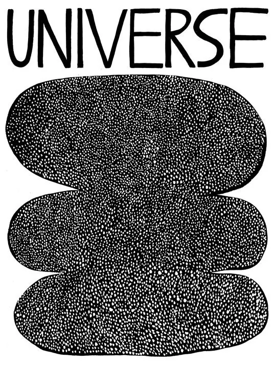
The word UNIVERSE in informal hand-drawn sans-serif positioned above two large stippled organic ovals, creating a typographic logo with textured depth.
Summary
A hand-drawn all-caps wordmark sits above two large stippled organic shapes, blending informal lettering with abstract textured forms for an expressive, geometric identity.
Visual description
Black on white, portrait format. The word UNIVERSE is set in a loose, informal sans-serif with slightly irregular letterforms and varying line weight, hand-drawn in style. Below, two stacked organic rounded shapes, each filled entirely with a dense dot or stipple pattern. The dots are uniform in size and spacing, creating a grainy, tactile quality that contrasts with the fluid letterforms above. No other elements; composition is simple and symmetric.
Key takeaway
The pairing of human, hand-made lettering with mechanical, geometric infill creates personality. The stipple pattern generates depth and visual interest while staying monochromatic. The vertical stacking with breathing room between word and shapes makes a memorable, lockup-ready mark.
Reuse notes
Strong for creative, design-focused, or editorial brands seeking approachability and craft. The stipple technique is labor-intensive to execute in practice; best reserved for marks that will endure and be reproduced consistently. Hand-drawn letterforms pair well with geometric or abstract elements for contrast and balance.