Preview image. Unlock full-res
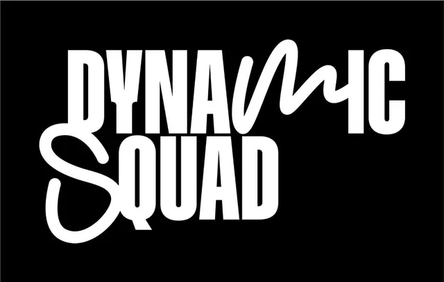
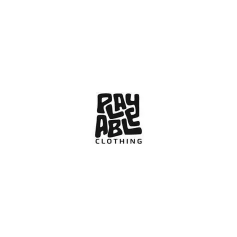
Stacked blocky sans-serif logotype with tilted letter forms spelling a clothing brand name on white background.
Summary
A stacked streetwear logo built from thick, tilted sans-serif letterforms spelling "RAY ABLE" with a separate "CLOTHING" subheader.
Visual description
Two stacked text blocks in heavy black sans-serif. The top word "RAY ABLE" uses tall, chunky condensed letters with a subtle rightward tilt (suggesting hand-sketched energy or street-art influence). Individual letters appear slightly irregular in spacing, creating visual rhythm and intentional casualness. The word "CLOTHING" sits directly below in smaller, upright, letter-spaced type. The entire composition centers on a clean white background, relying on extreme black-white contrast for impact. The letter geometry is geometric and blocky, with thick strokes and tight counters typical of streetwear and underground apparel branding.
Key takeaway
The rightward tilt in the main logotype adds personality and movement without losing legibility, making it feel hand-crafted rather than corporate. Stacking two text levels (the brand name + category) creates hierarchy and context. Using a single heavy weight sans and letting geometry (not color or effects) carry the design is efficient and scalable.
Reuse notes
Perfect for streetwear, apparel, and youth-focused brands wanting confident, bold typography without illustration. The hand-drawn tilt works in print, embroidery, and screen printing. Works best on dark grounds and at large sizes; small applications risk the tilt becoming hard to read. Pair with sans-serif body copy only.