Preview image. Unlock full-res
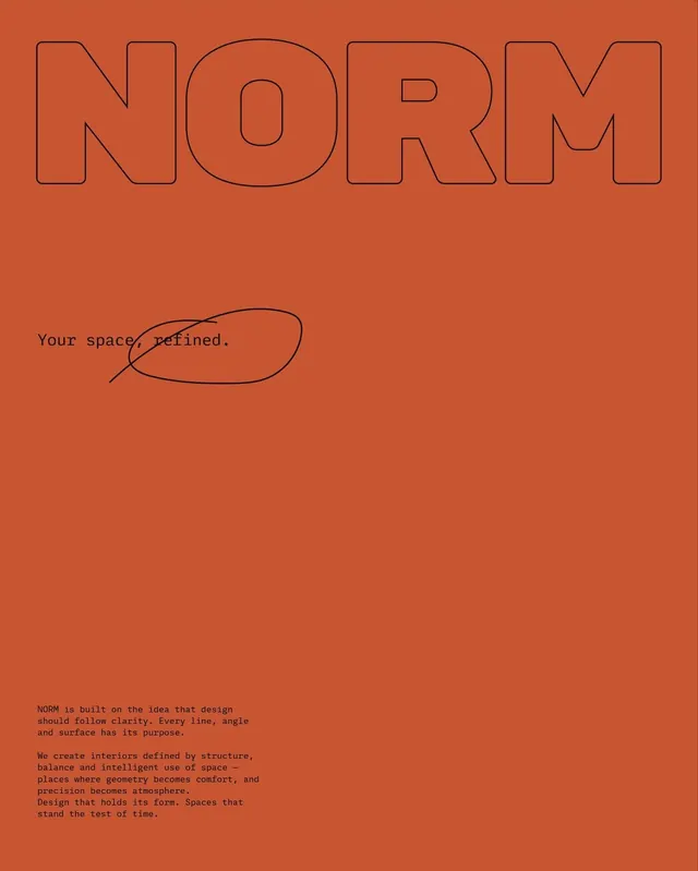
Interior design wordmark in outline sans with tagline and brand philosophy on burnt-orange background, emphasizing structured design principles and spatial clarity.
Summary
Interior design wordmark in outline sans with tagline and brand philosophy on burnt-orange background, emphasizing structured design principles and spatial clarity.
Visual description
Large uppercase NORM in bold outline sans-serif dominates the top third, letterforms rendered as strokes with negative space visible inside each character. Below sits a simple handwritten-style underline circling the word "space, refined" as the tagline. Further down, a block of monospaced body text in dark brown reads: "NORM is built on the idea that design should follow clarity. Every line, angle and surface has its purpose." Follows with philosophy about interiors defined by structure, balance, intelligent space use, and precision. All text set against a warm burnt-orange background that extends edge-to-edge.
Key takeaway
The outline/stroke wordmark treatment which emphasizes the counter forms and grid-like proportions of the letters. The pairing of geometric uppercase with flowing handwritten tagline adds approachability to rigorous design principles. The full-bleed color ground anchors the brand as bold and confident.
Reuse notes
Strong for architecture, design, or creative strategy firms where clear, principled thinking is central to the pitch. The monospaced philosophy block feels technical and deliberate. Outline letterforms work best at large scale; smaller applications may need filled versions. The warm orange signals creativity and energy while the structured type system suggests rigor. Avoid competing imagery on this background.
More like this


Keep what you find
A free account saves references to boards and can send you a weekly email of picks based on what you save.
To see every result, go Pro.