Preview image. Unlock full-res
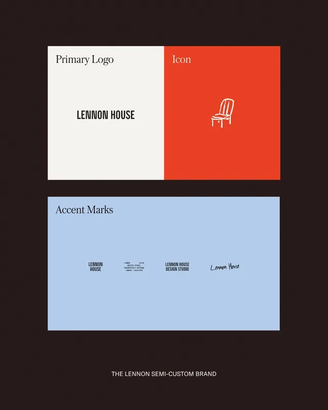
Modular brand identity for Lennon House featuring serif wordmark on cream background paired with bold orange block containing line-drawn chair icon and accent variations.
Summary
Modular identity for Lennon House pairing a serif wordmark on cream with an orange accent block showcasing a line-drawn chair icon, plus secondary wordmark and handwritten script variations.
Visual description
Upper section split 50/50: left shows "LENNON HOUSE" in large serif type on cream background; right shows bright burnt-orange field with a single white line-drawn chair icon centered. Lower section on light blue shows three wordmark variations (solid, stacked, handwritten script) plus small reference text. Dark background surrounds. Typography uses serif for primary mark, sans-serif for labels.
Key takeaway
The color-blocking strategy (orange as sole accent color applied to icon container, not the primary mark); mixed typographic approach (serif primary, sans-serif supporting) for hierarchy; the chair as a simple recognizable motif tying to furniture or interior identity.
Reuse notes
Strong template for any interior design, furniture, or hospitality brand. The split-layout and color contrast works at small sizes on social or stationery. Serif + sans combination is classic and trustworthy for upscale positioning. Chair icon is brand-specific; swap for relevant object.
More like this







Keep what you find
A free account saves references to boards and can send you a weekly email of picks based on what you save.
To see every result, go Pro.