Preview image. Unlock full-res
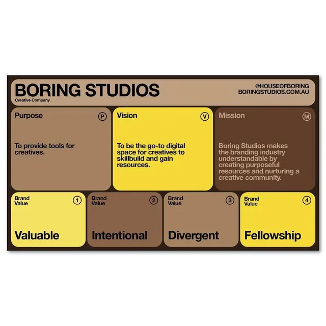
Earthy branded identity document organizing three core pillars (Purpose, Vision, Mission) and four brand values in a structured color-blocked grid.
Summary
Brand identity system for Boring Studios presenting Purpose, Vision, and Mission statements in three large cards, with four core brand values below.
Visual description
A structured brand-guidelines page with dark border containing: cream header bar (top) with "BORING STUDIOS / Creative Company" in large sans-serif, contact info aligned right. Three large color-blocked cards below (tan/beige, bright yellow, dark brown) contain Purpose, Vision (highlighted in yellow), and Mission statements in left-aligned body text. A second row displays four numbered brand values (Valuable, Intentional, Divergent, Fellowship) in a 2x2 grid mixing yellow and tan backgrounds. All cards have rounded corners; each text block is proportionally spaced. Typography is bold, modern sans-serif throughout; color carries semantic weight (yellow emphasizes the Vision).
Key takeaway
Using color to highlight primary content (Vision in yellow draws the eye). The combination of structured grid layout with warm, earthy tones creates both rigor and approachability. Rounded corners soften the geometric layout. The balance of filled cards and text spacing provides breathing room without unnecessary whitespace.
Reuse notes
Ideal for agency, consulting, or service-based brand materials where values clarification is central. The earthy palette reads as thoughtful and grounded; works especially well for companies in creative, design, or human-centered fields. The grid adapts easily to 3-4 values and 1-2 statement types without rework.
More like this



Keep what you find
A free account saves references to boards and can send you a weekly email of picks based on what you save.
To see every result, go Pro.