Preview image. Unlock full-res
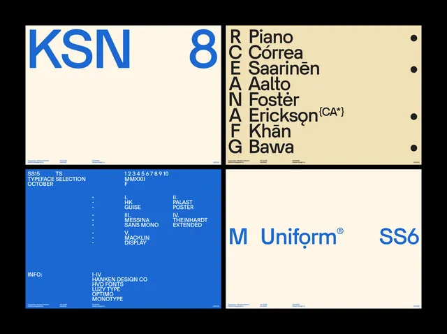
A grid-based identity system with a bold blue primary mark, modular type scale, and personnel directory, demonstrating systematic brand governance.
Summary
A modular identity system guide showing a bold blue KSN mark, a personnel roster, typography samples, and the M Uniform typeface application.
Visual description
A four-panel identity reference: top-left shows "KSN" in oversized blue sans-serif against a cream background, with a personnel directory listing names (Piano, Correa, Saarinen, Aalto, Foster, Erickson, Khan, Bawa); top-right displays the same cream ground with call-and-response lettering identifying each name; bottom-left is a dense technical information block on saturated blue with white sans-serif type at multiple scales, listing departments and contact details; bottom-right isolates "M Uniform SS6" as a product or type specimen. The grid is strict, with bold black dividers separating each section. Color contrast is maximized: cream, black, and blue only.
Key takeaway
The tight, systematic four-square layout for presenting multiple information layers (mark, personnel, technical details, typography specimen) in a single view. The cream/blue/black palette is confident and legible at small sizes. The personnel list as a direct extension of the mark's presence is memorable and humane.
Reuse notes
Strong for tech, software, or institutional brands needing to show systematic structure. The density and technical tone suit developer tools, product studios, and design systems. Scale down for digital products; this layout works best when printed large or as a digital reference guide. Not suitable for consumer brands needing warmth or narrative.
More like this



Keep what you find
A free account saves references to boards and can send you a weekly email of picks based on what you save.
To see every result, go Pro.