Preview image. Unlock full-res
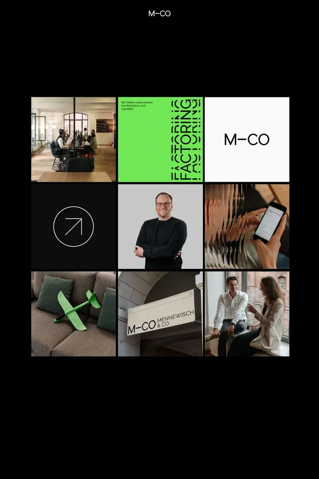
M-CO brand identity collage showing wordmark, geometric icon, photography, product design, and environmental applications in minimal, high-contrast aesthetic.
Summary
M-CO brand system documentation presenting the wordmark, a geometric arrow icon, photography direction, personnel portraits, product mockups, and spatial branding across a structured 3x3 grid with lime-green accent blocks.
Visual description
A 3x3 grid on a black background arranges nine squares showing different brand applications. Top row: office interior photography (natural light, wooden furniture, people in conversation), a lime-green block with repeated stacked "ICOZZ" text pattern, and the white "M-CO" wordmark centered on white. Middle row: a white circular icon containing a minimalist arrow in a white circle on black, a portrait of a bearded man in casual black clothing on light gray, and a close-up photo of hands holding a smartphone. Bottom row: lime-green geometric elements (curved X shape) on a textured beige sofa, a white "M-CO MENNEWEISCH" sign mounted on a modern interior wall, and two people in professional dress collaborating near a window. The wordmark uses a clean, minimal sans-serif. The color palette stays strictly to black, white, grays, and a bright lime-green. Typography is restrained; the grid itself is the dominant visual structure.
Key takeaway
The 3x3 grid format efficiently shows brand application across multiple contexts (environment, product, people, graphics) in one cohesive view. The lime-green accent acts as a unifying visual thread across abstract and photographic elements. The repeated geometric pattern in green creates texture and movement without color complexity, making it memorable and scalable to environmental signage.
Reuse notes
Ideal for consulting, creative services, or corporate identity work where showing breadth (office culture, digital product, team personality) matters. The high proportion of photography gives the brand a human, approachable feel despite the minimalist aesthetic. Works well in digital brand guidelines; the grid structure adapts cleanly to mobile and desktop presentations. Avoid heavy usage of the lime accent on small UI; it reads better in print and larger scales.
More like this



Keep what you find
A free account saves references to boards and can send you a weekly email of picks based on what you save.
To see every result, go Pro.