Preview image. Unlock full-res
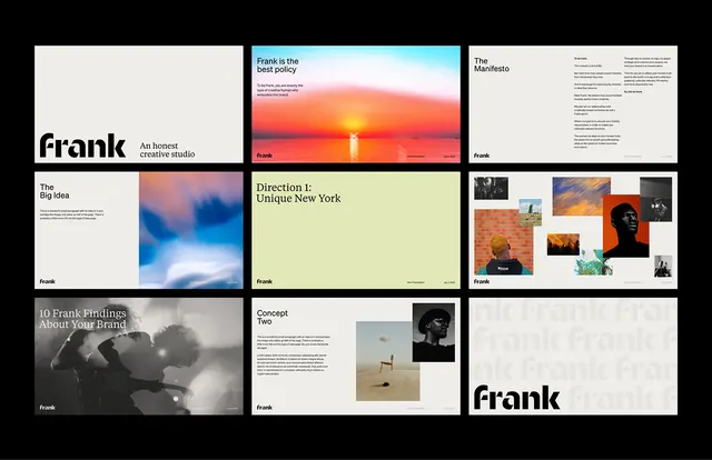
A 3x3 grid of brand-system pages mixing stark black-and-white photography, warm sunlit landscapes, and solid color blocks in a editorial identity for Frank.
Summary
A 3x3 grid of brand-system pages mixing stark black-and-white photography, warm sunlit landscapes, and solid color blocks in an editorial identity for Frank.
Visual description
A modular 3x3 grid on a black background showcasing the "Frank" brand identity across 9 pages. The layout alternates between photography-heavy spreads and typographic/color moments. The top row includes a minimal "frank" wordmark on off-white, a dramatic sunset image over water, and a typography detail page. The middle row features a high-contrast black-and-white documentary photograph (two women in conversation), a pale yellow-green color block with type overlay, and an orange solid-color accent page. The bottom row shows another black-and-white photograph, a minimal text-only page, and a large "frank" wordmark treatment. Colors are deliberately restrained: cream, pale yellow-green, warm orange, charcoal gray, and black, with photography carrying the emotional weight. The sans-serif type is clean and modern, supporting rather than dominating. The overall effect is serious, confident, and rooted in authentic imagery.
Key takeaway
The pairing of honest documentary photography with geometric color accents. The discipline of rotating between full-bleed imagery, minimal type, and solid color blocks to create rhythm across a presentation. The use of warm tones (sunset, golden light) and cool tones (gray, black) in counterpoint.
Reuse notes
Ideal for media companies, creative studios, editorial brands, or publishers. The documentary photography style works for B2B positioning that emphasizes authenticity and human insight. Avoid if the client needs a lighter, more approachable tone; this system skews serious and sophisticated. Strong for annual reports, agency portfolios, or brand guidelines for news/culture outlets.
More like this




Keep what you find
A free account saves references to boards and can send you a weekly email of picks based on what you save.
To see every result, go Pro.