Preview image. Unlock full-res
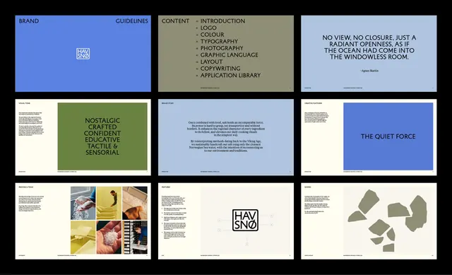
A comprehensive brand guidelines grid showing logo lockups, content taxonomy, photography direction, typography, layout systems, and pattern language in cool blue and neutral tones.
Summary
A multi-panel brand guidelines grid showing a complete identity system including brand rules, content sections, logo treatments, photography, type hierarchy, and geometric pattern language in cool blue and neutral tones.
Visual description
A 3x3 grid of brand guidelines sheets on white, cream, and light blue backgrounds. Top-left shows the brand logo and basic rules on a saturated blue field. Top-center lists content categories (introduction, logos, color, typography, etc.) on neutral green-tan. Top-right displays a blue panel with inspirational tagline about open space. Middle row shows photography direction (nostalgic, colorful images), body copy guidelines with justified text blocks, and bold blue headline block reading "the quiet force". Bottom row features a mosaic of photography samples (food, instruments, textures), a stacked logo lockup labeled "hav sno", and geometric clay-colored paper shapes arranged asymmetrically. Sans-serif type throughout, ample whitespace, strict modular structure.
Key takeaway
Use a multi-panel grid format to compress a full brand system into one reference sheet. Pair a strict blue primary with warm neutral accents (tan, grey, cream) for sophistication. Show logo usage rules, mood photography, and structural patterns side-by-side to demonstrate a cohesive language, not isolated rules.
Reuse notes
Reference for building comprehensive brand guidelines. Works well for agencies, tech, or editorial brands needing to show both structure and personality. The photography mood anchors the system's tone; ensure samples genuinely reflect the brand voice.
More like this





Keep what you find
A free account saves references to boards and can send you a weekly email of picks based on what you save.
To see every result, go Pro.