Preview image. Unlock full-res
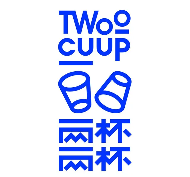
Bilingual wordmark stacking English text with Japanese characters, unified by geometric line-drawn cup icons in vibrant blue.
Summary
A bilingual brand mark combining English "TWO CUP" and Japanese/Chinese characters in a vertical stack, unified by two geometric outlined cup icons rendered in bright blue.
Visual description
The composition stacks five elements vertically, each centered and separated by negative space. At the top sits "TWO" in a compact, bold sans-serif; below it the outlined icons of two simple cup shapes, rendered with clean strokes and internal void spacing. Between the cups sits the English letter "CUP", then two identical lines of Japanese/Chinese characters at the bottom, each with zigzag and pictographic elements rendered in the same outline style and blue as the cups. All elements use consistent line weight and stroke treatment. The simple white background amplifies the blue wordmark and icon clarity.
Key takeaway
The pairing of Latin letters with East Asian characters through consistent geometry and weight - each script receives equal design treatment rather than hierarchy. Outlined icons that echo letterform weight and spacing create visual unity between pictographic and typographic elements. Vertical organization with strategic negative space reads clearly at all scales.
Reuse notes
Strong for brands serving bilingual or multicultural audiences, particularly in food, beverage, or hospitality. The outlined cup icons create immediate product association without relying on filled shapes. Blue with white and geometric sans-serif reads as modern and friendly. Scale cleanly to signage, packaging, and digital applications without loss of clarity.