Preview image. Unlock full-res
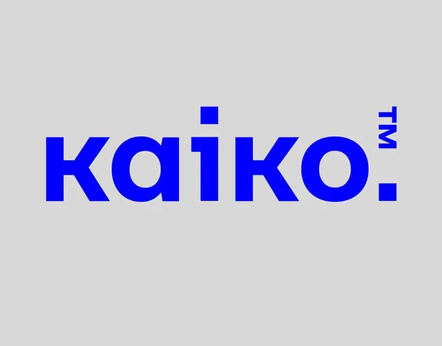
Bold, blue sans-serif wordmark with geometric superscript trademark symbol centered on neutral gray, demonstrating confident typographic minimalism.
Summary
Bold, blue sans-serif wordmark with geometric superscript trademark symbol centered on neutral gray, demonstrating confident typographic minimalism.
Visual description
A full-width composition centers the wordmark "kaiko." in a heavy, sans-serif typeface rendered in vibrant blue against a light gray background. The proportions are generous, with ample negative space above and below the text. A small, geometric trademark symbol (superscript registered mark or similar) sits in the upper right corner of the composition, echoing the sharp, angular character of the type. The typeface appears to be a contemporary geometric sans-serif with uniform stroke weight and circular counters (notably in the "a" and "o"). The centered placement and substantial point size emphasize clarity and direct communication.
Key takeaway
The confident use of a single bold typeface at large scale with minimal supporting elements; the geometric superscript mark as a compositional accent rather than a functional afterthought; the color choice of a saturated, primary blue that reads as both digital and timeless against neutral gray.
Reuse notes
Effective for tech, fintech, or professional service brands seeking bold, no-nonsense identity. Works equally well at display scale or reduced size due to the clear letterforms. The superscript mark technique can elevate a straightforward wordmark by adding a subtle design detail. The blue-on-gray pairing suggests stability and modernity; less common than blue-on-white, it adds distinction.
More like this


Keep what you find
A free account saves references to boards and can send you a weekly email of picks based on what you save.
To see every result, go Pro.