Preview image. Unlock full-res
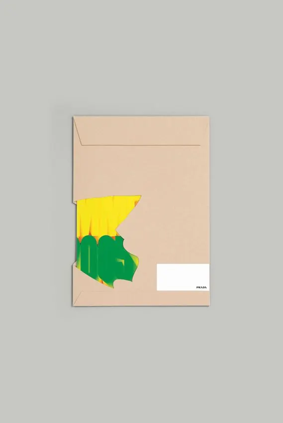
Kraft envelope with an organic two-part graphic mark in yellow and forest green, anchored with a white address label bearing a logo.
Summary
A kraft envelope featuring a two-layer organic graphic mark in bright yellow and deep green, paired with a white address label in the lower right.
Visual description
A beige kraft envelope sits centered on a neutral gray background. A jagged organic shape overlays the center-left area in two colors: a bright yellow upper section and a deep forest green lower section, both with irregular, torn-paper-like edges. The shapes nestle together vertically, creating a sense of movement and natural flow. A small white rectangular label appears in the lower right corner, marked with a small logo. Subtle fold lines are visible on the envelope flap.
Key takeaway
The contrast between the neutral substrate and a two-part accent graphic that uses high-saturation color to catch the eye. The organic, jagged edges give a handmade or sculptural quality despite being printed flat, making minimal stationery feel intentional and artful. Using color layering (yellow over green) adds depth without adding complexity.
Reuse notes
Strong approach for craft-focused or luxury brands wanting to stand apart on plain stationery. The technique translates well to labels, letterheads, and packaging where you want a subtle field of color to host a strong accent graphic. Works best when the brand can live in two or three saturated hues against a single neutral tone.