Preview image. Unlock full-res
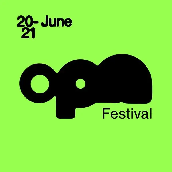
High-contrast branding combining a playful black elephant silhouette with bold sans-serif typographic treatment on vibrant neon-green background.
Summary
A festival identity built on a single bold gesture: a black elephant head silhouette set against neon-lime green, paired with stacked date/event typography in clean sans-serif.
Visual description
Neon-green background fills the entire frame. In the upper left, "20-June 21" sits in black sans-serif, tightly stacked (the "20-" and "21" each on their own lines). Center-left, a chunky black solid silhouette of an elephant head with bulbous rounded forms, white dot highlights for eye and tusk accent. To the right, the word "Festival" in the same bold, modern sans-serif, aligned with the middle of the logo mark. The composition is asymmetric but balanced through the implied relationship between the date text and the elephant symbol.
Key takeaway
The fearless color pairing (maximum contrast between lime and black) creates instant recognizability and durability across formats. The elephant silhouette is sophisticated enough for an identity while playful enough for events. Stacking the date as type adds rhythm and avoids a bottom-heavy layout.
Reuse notes
Strong for event/festival branding and music/culture clients where energy and distinctiveness matter more than corporate restraint. The neon green becomes a signature color that will own social media and print collateral. Works best when that color is the dominant brand vehicle; harder to use in logo-only applications without the green field.
More like this

Keep what you find
A free account saves references to boards and can send you a weekly email of picks based on what you save.
To see every result, go Pro.