Preview image. Unlock full-res
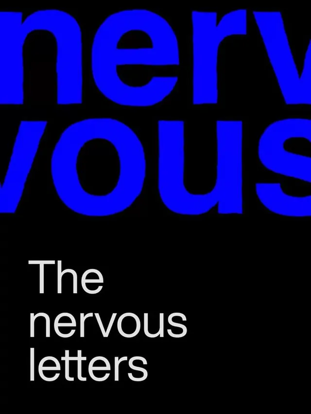
Large geometric sans-serif in electric blue set against black, with white explanatory text positioned low, reading 'The nervous letters'.
Summary
Large geometric sans-serif in electric blue set against black, with white explanatory text positioned low, reading 'The nervous letters'.
Visual description
A two-tier layout on a pure black background. The upper two-thirds are occupied by two rows of oversized letters in electric indigo-blue, rendered in a geometric sans-serif with slab-like weight. The letters appear fragmented or stacked to read "nerwous" (apparent intentional spelling) across the top. A faint grid overlay—thin horizontal and vertical lines—structures the composition and adds technical rigor. Below, anchored at the lower left, white sans-serif text in much smaller scale reads "The nervous letters," explaining the typographic play above.
Key takeaway
The use of geometric, almost industrial sans-serif in a single neon accent color to command space. The grid overlay adds structure and contemporary editorial flavor without cluttering. The size jump between headline and caption creates clear hierarchy and draws the eye to the type study itself first, context second.
Reuse notes
A strong reference for contemporary publishing, design studios, media outlets, or tech brands that want to project confidence and modernity. The fragmentation and play on "nervous" hints at experimental or avant-garde positioning. Works best on dark or black backgrounds; the contrast is essential to the impact.
More like this
Keep what you find
A free account saves references to boards and can send you a weekly email of picks based on what you save.
To see every result, go Pro.