Preview image. Unlock full-res
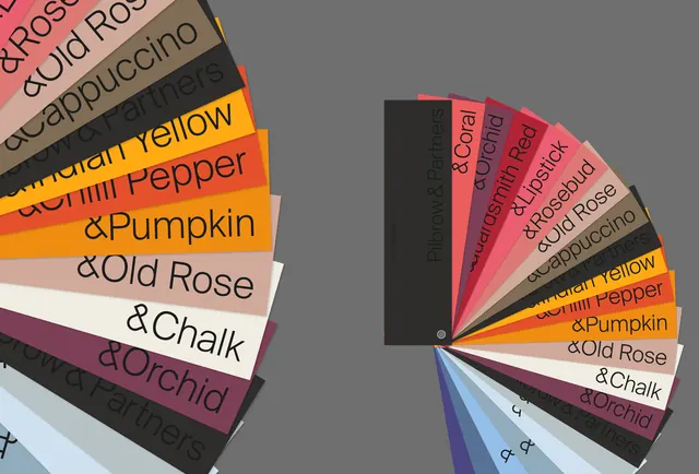
Product sample system with color-blocked labels arranged in a radiating fan pattern, each label showing a color name and description in minimal sans-serif type.
Summary
Product sample system with color-blocked labels arranged in a radiating fan pattern, each label showing a color name and description in minimal sans-serif type.
Visual description
Two fan-spread compositions side-by-side, each made of overlapping rectangular labels radiating from a central point. The left fan shows 6-8 elongated labels in warm hues (coral, peach, orange, mauve, grey, cream, white) with product names and descriptors in black sans-serif text (e.g. 'Chili Pepper & Pumpkin', 'Old Rose', 'Chalk', 'Orchid'). The right fan mirrors the arrangement with a similar palette and typography layout. A gray rectangular anchor block sits between the two fans, providing neutral contrast. The labels are slightly rotated and stacked, creating a dimensional, fan-like spraying effect. The overall palette reads artisanal and warm, with muted saturations suggesting natural or vintage product lines (cosmetics, tea, ceramics).
Key takeaway
The radiating fan layout is a compact way to show a full color system or product range without needing a grid. Label typography is tiny but clear, leveraging the color to do the work. Anchoring the center with a neutral block grounds the floating labels and provides visual breathing room.
Reuse notes
Perfect for artisanal brands (tea, cosmetics, home goods, pottery) showing a color range or seasonal palette. The warm, muted palette and hand-curated feel suit brands positioning as natural, small-batch, or heritage. The fan layout works best when printed or displayed in contexts where the radiating motion is visible (catalogs, brand decks, lookbooks); in UI, it reads as an unusual card arrangement. Works best at medium to large scale where the label text remains legible.