Preview image. Unlock full-res
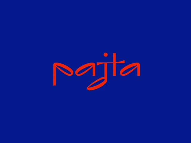
Paytia wordmark in bold orange-red outline lettering with a single accent dot, set against a deep royal blue background.
Summary
Paytia wordmark in bold orange-red outline stroke with flowing letterforms and a single accent dot, set against a saturated deep blue.
Visual description
A horizontal wordmark in vibrant neon orange-red outline (not filled), letterforms drawn with thick, consistent strokes and organic curves. The custom lettering is open and airy, with slight fluid movements in the strokes suggesting a tech brand with personality. A small orange-red circle accent appears above and to the right of the wordmark. The entire composition floats centered against a uniform deep royal blue background, creating strong color contrast. The outline treatment gives the mark a modern, almost sketch-like quality despite its geometric precision.
Key takeaway
Outline wordmarks create a lighter, more contemporary feel than solid fills and read well at small sizes. The accent dot provides visual rhythm and can aid recognition. The color combination of neon orange-red and deep blue is high-energy and distinctive, avoiding generic fintech blues and grays.
Reuse notes
Strong for fintech, payments, or modern SaaS brands needing to stand out. The outline approach works at any scale and pairs well with clean sans-serif supporting type. Ensure sufficient contrast in application backgrounds; this is designed for dark or branded backgrounds, less effective on mid-tone surfaces.
More like this

Keep what you find
A free account saves references to boards and can send you a weekly email of picks based on what you save.
To see every result, go Pro.