Preview image. Unlock full-res
A vibrant brand identity system for Unbox featuring fluid gradients, logo applications, and mockups across screens, signage, and objects.

Summary
A vibrant brand identity system for Unbox featuring fluid gradients, logo applications, and mockups across screens, signage, and objects.
Visual description
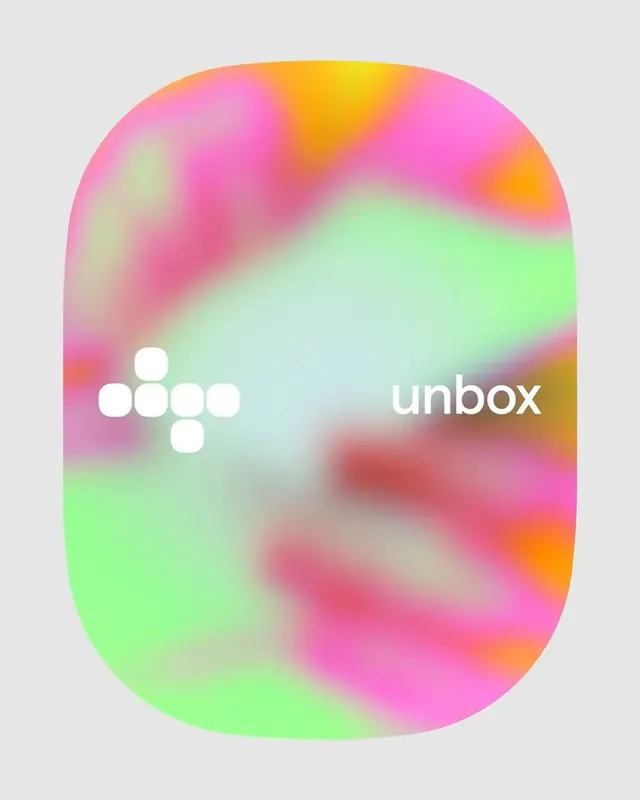
A soft-cornered rectangle frame filled with a smooth gradient blending pink, yellow, green, and orange in flowing transitions. A minimalist white dotted plus symbol sits on the left, balanced against the lowercase 'unbox' logotype in soft white sans-serif aligned to the right. The gradient flow creates motion and energy within the contained shape without jarring transitions.
Key takeaway
Layer smooth, multi-hue gradients within a single container to suggest fluidity and movement while keeping the mark clean and legible.
Reuse notes
Reach for this as a identity system reference. Pairs with abstract, experimental directions. Original by Twice Shy.