Preview image. Unlock full-res
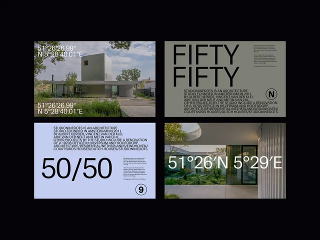
A 2x2 grid layout combining architectural photography, minimalist wordmark, data coordinates, and typographic hierarchy to present a design studio or real-estate brand as precise and location-aware.
Summary
A 2x2 grid combining architectural photography, a minimalist wordmark, a 50/50 ratio icon, and geographic coordinates to establish a brand identity rooted in precision, place, and architectural documentation.
Visual description
Four distinct panels arranged in a 2x2 grid on a black background. Top-left panel: a square crop of minimalist architecture, a light-colored building exterior with muted greens and grays. Top-right panel: dark gray background with "FIFTY FIFTY" in white sans-serif capitals at top, followed by smaller gray metadata text (unclear at this scale). Bottom-left panel: light lavender-blue background with "50/50" in large sans-serif numerals, accompanied by a small circular icon (#9) suggesting a design-system notation. Bottom-right panel: another architectural photograph showing a building facade with coordinates overlaid in white text ("51°26'N 5°29'E"). All typography uses a consistent geometric sans-serif. The color palette is coolly muted: grays, whites, soft blues, and the warm beige and muted green of the architectural photography.
Key takeaway
A 2x2 grid layout is a strong container for a multi-faceted brand identity: photography, wordmark, icon, and data coexist without visual conflict. Pairing a design studio or real-estate brand name with geographic coordinates creates authority and specificity. The 50/50 concept (likely representing equal partnership or balanced proportion) is expressed both typographically (the "50/50" text) and conceptually (the grid's symmetry). A minimal color palette ensures legibility and sophistication across print and digital applications.
Reuse notes
Ideal for architecture practices, real-estate collectives, or design partnerships that want to emphasize geographic precision and methodical thinking. The grid format translates to business cards, letterheads, website layouts, and presentation slides. The coordinate overlay is especially effective for location-based brands. This system assumes strong architectural or environmental photography as an asset; it would not work as well without that visual anchor.