Preview image. Unlock full-res
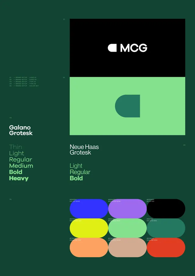
Complete brand identity system featuring MCG wordmark, two paired sans-serif typefaces, geometric mark, and structured color palette on a deep teal background.
Summary
Complete brand identity system for MCG displaying paired typefaces (Galano Grotesk and Neue Haas Grotesk), a geometric teal mark, and a vibrant color palette on deep teal background.
Visual description
The composition is organized on a deep muted teal (#114433) background divided into zones. Top left: MCG wordmark in white sans-serif on black. Top right: geometric form (a rounded rectangle segment in teal) as the brand mark on lime green rectangle. Left side: Galano Grotesk typeface specimen with weights from Thin through Heavy. Right side: Neue Haas Grotesk weights from Light through Bold. Bottom: a grid of twelve rounded-rectangle color swatches with hex codes, including bright blue, magenta, yellow, mint, peach, and crimson, organized in three rows. The entire layout follows a structured grid with precise numerical callouts (01-05) indicating design zones.
Key takeaway
Pairing two closely related sans-serif families for distinct roles (headline vs. body), laying out color palette in a systematic grid with hex codes labeled for developer reference, using a single geometric shape as the primary mark anchored across multiple applications, organizing identity information on a branded background to demonstrate how systems work in context.
Reuse notes
Ideal for corporate or B2B brands needing to demonstrate system rigor and scalability. The deep teal background works as a backdrop for showing applications, but the full color palette ensures flexibility across light and dark contexts. Works best when the second typeface is genuinely differentiated in function (here Galano for headlines, Neue Haas for body). The geometric mark's simplicity makes it reproducible at any scale.
More like this





Keep what you find
A free account saves references to boards and can send you a weekly email of picks based on what you save.
To see every result, go Pro.