Preview image. Unlock full-res
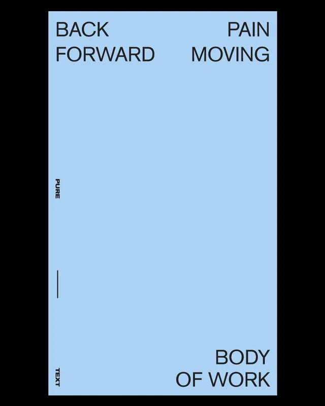
Minimal type specimen with four all-caps sections arranged vertically in light blue and dark grey, using pale blue background and dramatic negative space.
Summary
Pale blue background with four sections reading "Back Forward", "Pain Moving", "Pure", and "Body of Work", arranged vertically and horizontally in condensed all-caps sans-serif typography with a thin dark vertical divider down the left spine.
Visual description
A rectangular composition divided into a pale blue field. Four text blocks sit in all-caps: "Back Forward" (top-left), "Pain Moving" (top-right), "Pure" (left spine, vertical), "Body of Work" (bottom-right). A vertical dark grey line at left spine provides structural division. Typography is a narrow, geometric sans-serif in dark grey. Massive spacing dominates, with text occupying only the corners and edges, leaving the center entirely empty. The overall effect is architectural and controlled, emphasizing the letterforms and spacing as primary design elements.
Key takeaway
The restraint of showing so little—just four simple words spaced across a minimal grid creates an almost Constructivist feel. The vertical line as a quiet structural anchor without being decorative. Using all-caps, condensed sans-serif to compress information into a clean, gridded reading experience.
Reuse notes
Strong for medical, legal, or institutional branding where precision and calm authority matter. Works well in healthcare, corporate, and design-system contexts. The pale blue is specific; can feel cold if not paired with warmer accent colors elsewhere.
More like this



Keep what you find
A free account saves references to boards and can send you a weekly email of picks based on what you save.
To see every result, go Pro.