Preview image. Unlock full-res
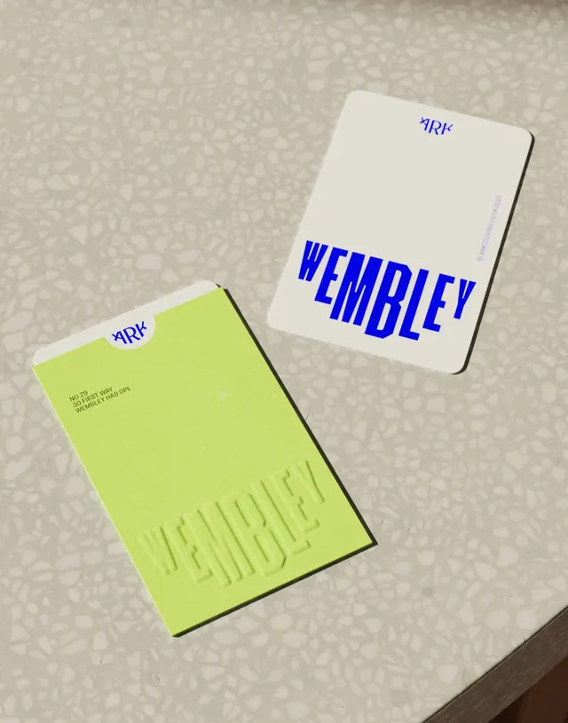
Stationery identity system using complementary lime green and navy blue, with structured sans-serif typography and tactile color-blocked cards on a textured surface.
Summary
Stationery identity system using complementary lime green and navy blue, with structured sans-serif typography and tactile color-blocked cards on a textured surface.
Visual description
Two business-card-sized pieces sit diagonal to one another on a textured, neutral linen surface. The left card is bright lime green (#C5DA69) with small navy text aligned bottom-left. The right card is cream-white with large navy sans-serif letters spelling a brand name vertically, overlaid with a small navy circular icon in the top corner. Both cards appear to have minimal, embossed detailing. The color contrast between the lime and navy creates immediate visual impact, while the cream card balances the composition. Typography is clean, modern, and confident without ornamentation.
Key takeaway
The high-contrast complementary color pairing (lime and navy) reads as fresh and energetic without being cheap. The two cards in a diagonal arrangement create visual dynamic without crowding. Using one accent color (navy) consistently across both cards ties them together as a system despite their different base colors. Minimal embossing or texture suggests quality and craft.
Reuse notes
Excellent for creative studios, design agencies, or young lifestyle brands where you want to stand out in a stack of white business cards. The lime green can feel overstated in contexts requiring formality (finance, legal); consider reducing its proportion or moving it to a secondary card if needed. Works best when printed on quality stock to reinforce the minimal aesthetic. The diagonal layout works in person but is harder to photograph effectively, so plan marketing mockups carefully.
More like this


Keep what you find
A free account saves references to boards and can send you a weekly email of picks based on what you save.
To see every result, go Pro.