Preview image. Unlock full-res
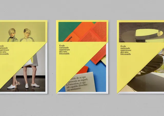
Trio of promotional postcards for a Paris arts school, each with a bright yellow field, diagonal color blocking, and cut-out photography.
Summary
Three promotional postcards for a Paris arts school, each anchored by a large bright yellow field with geometric diagonal sections, photography cutouts, and layered color accents.
Visual description
Three white-bordered postcards displayed flat on gray background. Each shares a dominant bright yellow panel (roughly 60 percent of the card) bisected by a diagonal line. The left card shows two headshot photographs against the yellow, with the school name "École nationale supérieure des Arts Décoratifs" and footer text in small black sans-serif. The center card layers geometric color blocks in green, orange, red, and blue behind the diagonal, overlaying a small cream-colored text block. The right card features a photograph of a sculptural object (reclining form) against a dark background above the yellow. All three use the same sans-serif typeface and diagonal geometric division, creating a unified series despite different photographic content.
Key takeaway
The restraint of three cards that are clearly related but visually distinct. The diagonal division as a binding device; the bright yellow as a unifying field that recedes behind imagery; the layered color blocking on the center card that suggests depth and movement without overwhelming the composition.
Reuse notes
Strong for educational or cultural institution branding where you need a series of cohesive but differentiated pieces. The diagonal cut works well for promotional postcards, invitations, or mailers that need to balance personality with institutional credibility. Works best when the photography or content in each variant is sufficiently distinct to carry visual interest.
More like this








Keep what you find
A free account saves references to boards and can send you a weekly email of picks based on what you save.
To see every result, go Pro.