Preview image. Unlock full-res
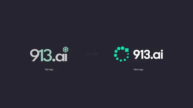
Side by side rebrand comparison putting the previous 913.ai logo next to the new dotted-ring mark and wordmark.
More like this
See all

Summary
A single dark frame arguing the rebrand: old logo at left, arrow, new logo at right, each captioned in small type.
Visual description
A flat dark plum-charcoal field with everything placed on one horizontal centreline and a lot of empty space above and below. At left, the previous logo: "913.ai" in a soft rounded geometric sans, the "9" and the ".ai" in cool grey, the "13" in a muted mint green, with a small faceted hexagon sitting like a dot above the "a". A thin grey arrow points right across the gap. At right, the new logo: a mark built from bright green dots and small squares arranged around an open ring with a gap at the upper right, followed by "913.ai" set in white in a tighter, more upright geometric sans with a rounded dot on the "i". Under each, centred, a small light grey caption reads "Old logo" and "New logo".
Key takeaway
The comparison is legible because both marks are shown at matched optical size on the same ground, so the only variables are form and colour. Swapping a literal shape for a ring assembled from repeating dots and squares gives the identity a pattern system for free, which the rest of the project then uses.
Reuse notes
Standard opener for a rebrand case study or an internal launch deck: it earns buy-in before any application is shown. Keep it to two states; a three or four step evolution needs a timeline layout instead. Only works on a neutral dark or light field, since any background colour would bias the comparison.