Preview image. Unlock full-res
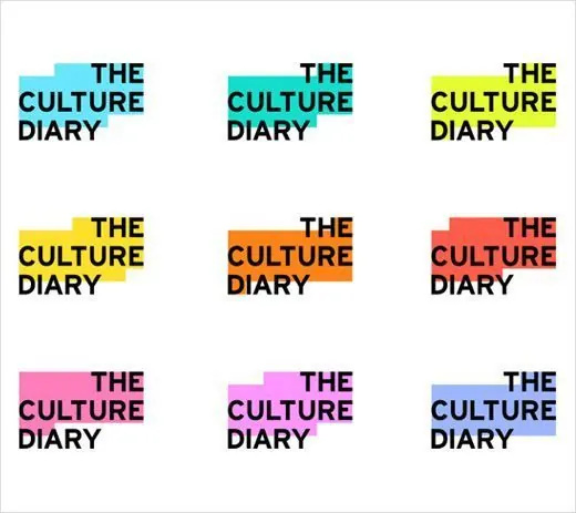
Nine variations of 'The Culture Diary' wordmark in a 3x3 grid, each rendered in a distinct color combination with complementary background rectangles.
Summary
Nine color-system variations of 'The Culture Diary' publication wordmark displayed in a 3x3 grid, each pairing black all-caps type with a colored geometric accent block.
Visual description
The wordmark "THE CULTURE DIARY" appears nine times in black bold sans-serif, all-caps, on a white background. Each iteration pairs with a solid-color rectangular block positioned to the right or below the type: cyan, teal, yellow, lime green, orange, red, pink, purple, and blue. The blocks are consistently sized and aligned, creating a systematic grid that showcases how a single typographic identity adapts across a defined color palette.
Key takeaway
Showing a wordmark in a color grid proves palette flexibility and system thinking. The rectangular accent blocks stay consistent in proportion and alignment, making the color-system grid scannable and production-ready. Black type + flat color maintains clarity at small sizes.
Reuse notes
Ideal for magazine mastheads, publication branding, and editorial houses. The geometric block acts as both decorative element and functional separator. Works well for guidelines and brand presentations. Each color variation can be assigned to different editorial sections or content types.
More like this


Keep what you find
A free account saves references to boards and can send you a weekly email of picks based on what you save.
To see every result, go Pro.