
Preview image. Unlock full-res
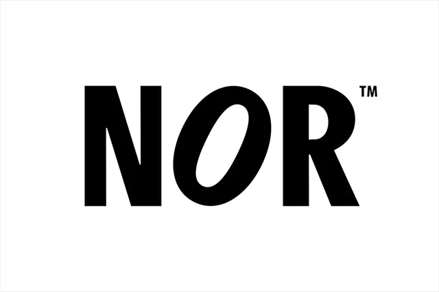
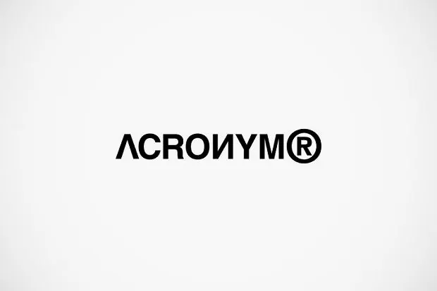
A confident, geometric sans-serif wordmark set in black on white, using character weight and inter-word spacing to signal modern authority.
Summary
A confident, geometric sans-serif wordmark set in black on white, using character weight and inter-word spacing to signal modern authority.
Visual description
A single-word wordmark in a heavy, geometric sans-serif typeface, centered on a pure white background. The letterforms are bold and slightly rounded at the terminals, creating a friendly but authoritative tone. Uniform letter spacing and consistent weight throughout give the mark a crafted, intentional feel rather than relying on any decorative elements. A small registered trademark symbol sits above the baseline to the right of the final letter. The mark occupies the central third of the frame, leaving generous white space around all sides.
Key takeaway
The discipline of pure typography with zero flourish, and how letter spacing (rather than width variation) creates visual rhythm and reinforces perceived authority.
Reuse notes
Strong baseline for tech, finance, or corporate branding where legibility and confidence matter more than distinction. Works equally well at small social-media sizes and large signage.
More like this




Keep what you find
A free account saves references to boards and can send you a weekly email of picks based on what you save.
To see every result, go Pro.