Preview image. Unlock full-res
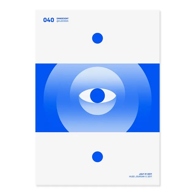
Modular design system pairing bold block letters (O40, FI, RM) with a large gradient-blue eye icon and color-blocked contact cards.
Summary
A modular brand system anchored by a large blue gradient eye and three separate identity cards organized around a vertical axis, each showcasing different staff members and contact details.
Visual description
Three white cards arranged vertically on a neutral background sit left to right. The top-left card displays the blocky letters O, 4, 0 and an identity mark. The central card holds a massive gradient-filled eye icon (deep blue outer iris, light blue gradient upper-white sclera) with a thin iris ring, flanked by contact information for staff (emails, phone numbers, social handles). Top-right and bottom-right cards repeat the contact-card layout with different names and details. Light gray dividing lines separate the card fields. The "040" and name typography uses a clean, geometric sans-serif in all-caps.
Key takeaway
The eye-as-centerpiece trick: a large, minimal icon (graduated fill, strong outline) anchors the entire system without becoming a logo. The card arrangement—three modules with equal weight—demonstrates system scalability. Negative space inside the cards (one zone per line of text) ensures breathing room even with dense contact info.
Reuse notes
Effective for design studios, creative agencies, or consulting firms needing a flexible staff/contact system. The gradient-eye can be replaced with any strong geometric icon and still work. Only works well if names and contact details are kept brief; dense lists break the grid visual balance.
More like this








Keep what you find
A free account saves references to boards and can send you a weekly email of picks based on what you save.
To see every result, go Pro.