Preview image. Unlock full-res
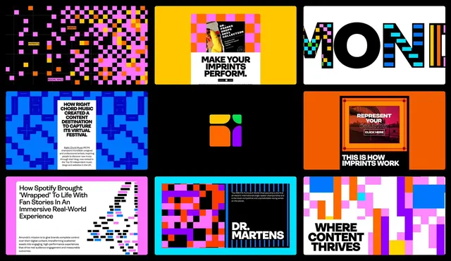
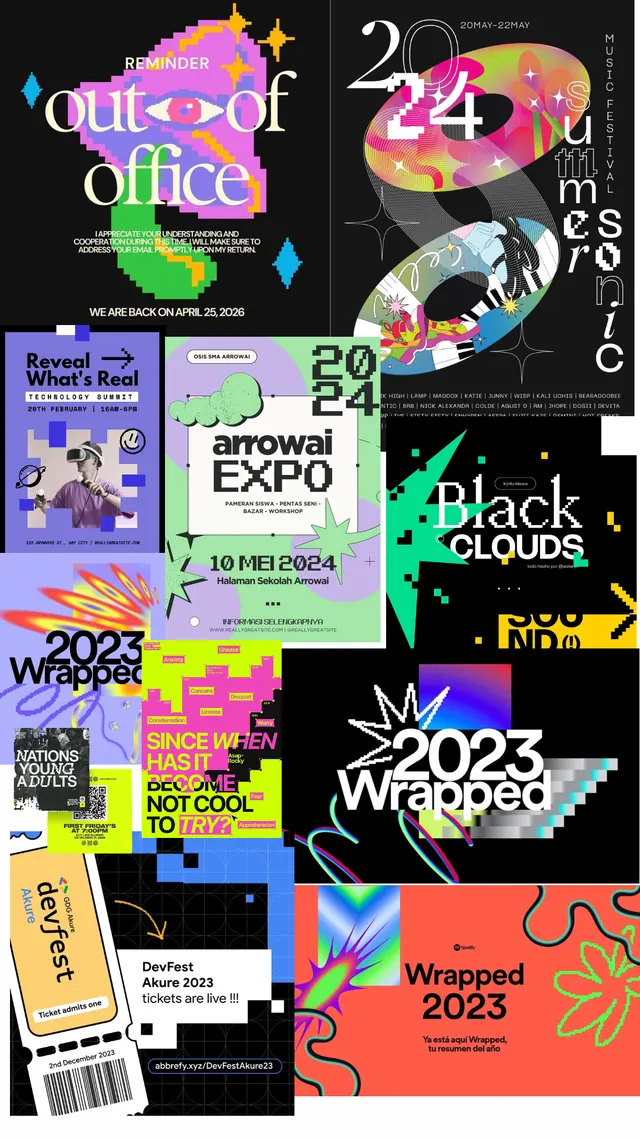
Dense overlapping grid of event and music festival posters layered on black, with neon pink, lime yellow, purple, and orange type on geometric shapes.
Summary
A dense, chaotic collage of overlapping music festival and event promotional posters all layered on a black background, using fluorescent neon type at multiple angles.
Visual description
Twenty to thirty poster segments crammed and overlapping across a black canvas at various scales and rotations. Each poster carries hand-lettered or display typeface headlines in hot pink, lime green, bright purple, yellow, and orange, often all-caps, set over geometric shapes (circles, parallelograms, irregular rectangles). Typography dominates; some posters show event names and dates (fragments like "out.of.office", "2024", "arrowal EXPO", "Black clouds", "2023 wrapped"), others show abstract dingbats and symbols (stars, diamonds, zigzags). Compositionally it reads as pure visual chaos by design, with no hierarchy beyond size. No photography, no illustrations, pure typography and geometric color.
Key takeaway
The proof that density and urgency can coexist with legibility when each element gets its own color. The neon palette on black is nearly impossible to ignore, so even when the eye doesn't parse every poster, it feels important. Hand-lettered display faces mixed with tight geometric sans give it personality while staying authoritative. The all-angles approach (some text vertical, some diagonal) signals event-culture energy without looking amateurish.
Reuse notes
This is the reference for "excited event brand" work. Works for music festivals, art openings, nightlife, tech conferences. The palette is punchy enough that it reads even at thumbnail. However, this level of layering only works when printed large or digital; any smaller and individual elements get lost. Best applied to poster campaigns, not to long-form documents or quiet editorial spaces where this much stimulation would exhaust the eye.