Preview image. Unlock full-res
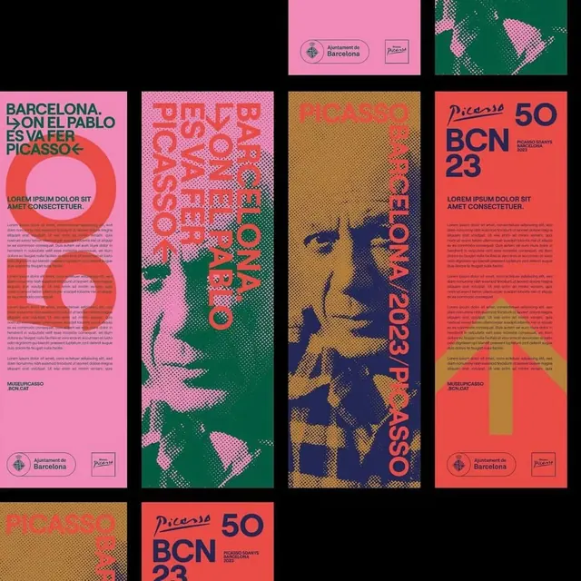
A cohesive exhibition identity for Picasso and cultural events in Barcelona, combining halftone portrait photography with vibrant geometric sans-serif type, rotated compositions, and warm-cool color blocking.
Summary
A multi-poster exhibition identity for Picasso and Barcelona cultural events, featuring halftone portrait photographs layered with rotated bold display type in warm and cool color blocks, unified across posters by consistent sans-serif wordmarks and logo placement.
Visual description
Four tall vertical poster treatments arranged in a grid (with cropped views above and below). Each poster employs the same design grammar: a halftone portrait (Picasso, and other faces) in either navy blue or coral-red ink, layered with geometric shapes and text in warm/cool complementary combinations. Typography is dramatically rotated (90-180 degrees on some posters), using sans-serif display faces in bold weights and scale. Color fields are hard-edged (hot pink, forest green, coral red, gold, navy, black) creating strong figure-ground separation and visual tension. Small logos and event information appear consistently (lower-left or top-right) in white text on colored bands or stamps. The overall effect is rhythmic and energetic: each poster reads as a distinct composition while the series feels unified through color palette, halftone technique, and wordmark placement.
Key takeaway
Halftone layers are high-impact and economical for photography reproduction, especially in multi-color offset printing. Rotating type dramatically across a layout (without losing legibility) breaks visual monotony and signals cultural/artistic confidence. Hard color blocking (2-3 hues per poster) paired with black or dark navy creates visual hierarchy and print-friendly separation. The consistent typemark and logo lock ensures brand recognition across variations.
Reuse notes
Ideal for cultural institutions, museums, galleries, and editorial campaigns. The approach thrives in print (posters, programs, invitations) but translates well to digital advertising. The halftone technique assumes sufficient print resolution and ink separation; screen/web use risks color registration artifacts. The strong geometric and color language feels dated if color palette is muted; refresh by adjusting hues, not strategy. Legibility is good at poster scale but tight at small sizes; test any secondary information at 2x3cm print scale.
More like this


Keep what you find
A free account saves references to boards and can send you a weekly email of picks based on what you save.
To see every result, go Pro.