Preview image. Unlock full-res
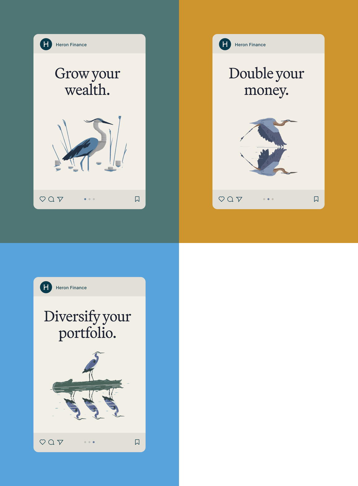
A fintech app card featuring the Heron Finance logo (H in a teal circle), a serif headline, and a minimalist illustration of a segmented heron among stylized reeds.
Summary
A branded app card for Heron Finance pairing the monogram logo and headline "Grow your wealth" with a minimalist illustration of a segmented heron surrounded by stylized reed stems.
Visual description
A tall, rounded-corner card sits on a soft teal background. At the top, a dark teal circular badge contains a white serif "H" monogram and is paired with the text "Heron Finance" in sans-serif. Below, the headline "Grow your wealth." is set in large serif type (high contrast against the cream background). The card's lower half shows a minimalist illustration of a heron with a detailed neck segmentation in multiple blue-grey tones, standing among thin, elongated reed elements in lighter blue. The reeds are scattered asymmetrically, giving the composition balance and organic feel. At the card's base are social icons and a pagination indicator, suggesting this is a carousel-style interface.
Key takeaway
The heron itself is a clever metaphor for financial grace and measured movement. The segmented neck treatment adds visual interest and craft to what could be a flat illustration. The pairing of serif headline with flat illustration creates hierarchy and refinement. The soft color palette (muted teal, cream, grey-blue) feels premium and trustworthy without being sterile, which is difficult in fintech design.
Reuse notes
Strong reference for wealth-management or investment apps where you need to convey sophistication, growth, and care. The nature-based illustration (heron, reeds) works for any financial product that wants to feel grounded rather than corporate. The serif/sans-serif pairing and color restraint are reproducible moves. Works as a standalone card or carousel component.