Preview image. Unlock full-res
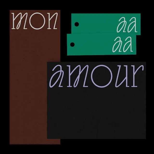
A minimalist identity system using outlined neon type and geometric color-blocking, balancing soft serif detail against industrial coolness.
Summary
A minimalist identity system using outlined neon typography paired with bold color-blocking to create visual tension between refined type and geometric form.
Visual description
Four rectangular color blocks arranged in a stacked composition on a black background: rust brown, deep teal, and black. Outlined letterforms in neon stroke style are overlaid, reading "MON", "amour", and "QQ.QQ" in a mix of display serif and sans-serif weights. The outlines glow with bright neon treatment (teal and white), creating contrast against the muted, earthy background blocks. Small serif details punctuate the teal section. Composition balances negative space with direct geometric placement, positioning the outlined glyphs to interact with the colored rectangles behind them.
Key takeaway
Combine outlined/stroke typefaces with solid color-blocking to create visual rhythm without heavy decoration. Neon outline detail against muted earth tones reads as both luxury and minimal. Use geometric rectangular frames to structure identity without requiring full-bleed imagery.
Reuse notes
Strong for design studios, creative agencies, and cultural brands wanting to balance minimalism with bold personality. The neon treatment works best against dark or muted backgrounds. Pairs well with serif typefaces for contrast between precise geometry and organic letterforms.
More like this


Keep what you find
A free account saves references to boards and can send you a weekly email of picks based on what you save.
To see every result, go Pro.